Rockbottom: Villa by OMA
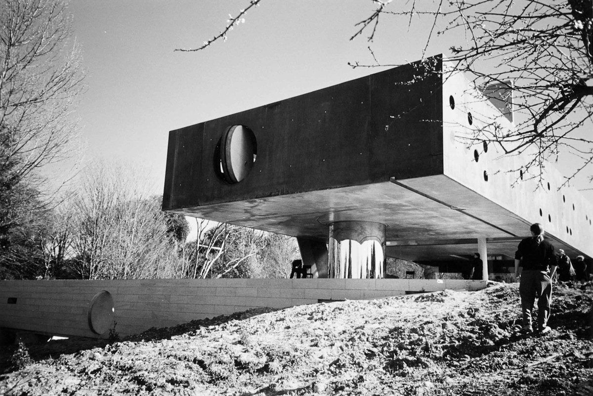
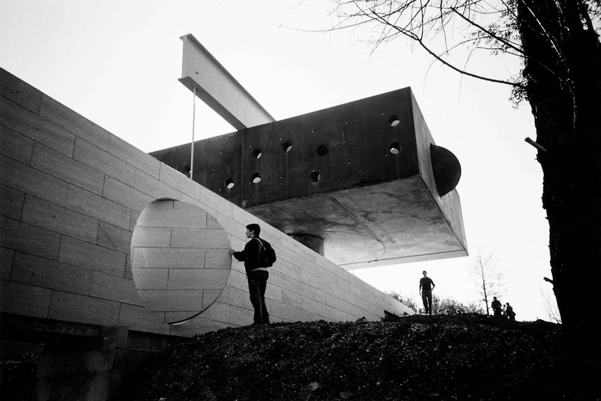
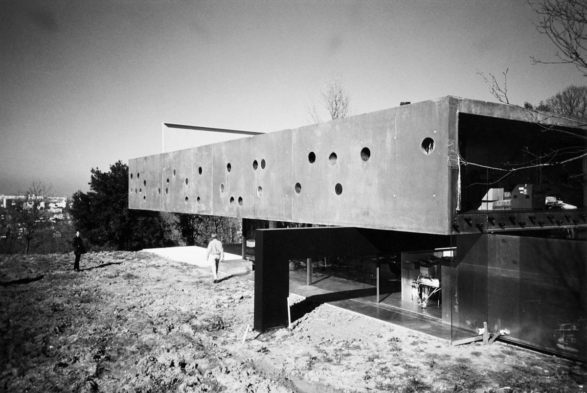
The house has been built for a wealthy publisher, his family, their guests, and some cars. The publisher was paralyzed from the waist down after a car crash—a rubber-burning, steel-twisting, bone-splintering, marrow-leaking, nerve-splitting car crash. The design is, among other things, a monumental accommodation to this fact. In no way does the architecture attempt to glaze over the minutiae of everyday life with architectural elegance and solemnity, as so often happens in villa design. What actually happened is that Rem Koolhaas has feverishly imagined architectural potential in this particular family’s life. He saw the limp lower body of the husband—supported by a whole arsenal of trusses, carts, belts—as architecture. He extrapolated this in a single, huge, heavy-duty contraption that provides the man with a way of moving through the house. Subsequently this contraption was made into the house’s organizational core (“A machine was its heart”1): going up, going down, going up, down, up. . . . In counterpoint to this hydraulic simplicity, the beautiful and lithe wife moves through the house at will, negotiating between the armpits and crotches of the house and its dematerialized, entropic, smooth, modernistic planes. Koolhaas also saw architectural potential in his constructionally counterintuitive decision to place the chromium tube on which the box-house lies off center, so that a huge beam had to be placed and then anchored in the ground with a big rock, to stop the house from toppling over.
Living
Visitors cannot look at the house as an architectural model that can be separated from its specific usage. The usual gaze of historians, critics, or architects won’t do. In fact, you are investigating the most intimate and personal details of this specific family’s life; the gaze is that of the babysitter wandering through the rooms, opening the drawers and looking in the medicine chest. At the same time, because in a way the family’s life has become architecture, the villa becomes strangely inclusive: a design equivalent of MTV’s soap vérité, The Real World. Lastly, the specific demands and wishes of this family are dealt with not so much on an architectural level as on a planning and engineering level, emphasizing infrastructure, technical facilities, zoning, and routing. The family’s life has been treated as an urban program that makes the house into a “New Town” and makes a visit to it an unexpectedly civic experience. The mode of description that this house seems to ask for is therefore a combination of abject speculation by a voyeur about the private lives of his desired objects and an urbanistic scenario in which different propositions are linked together by a hypothetical sequence or route.
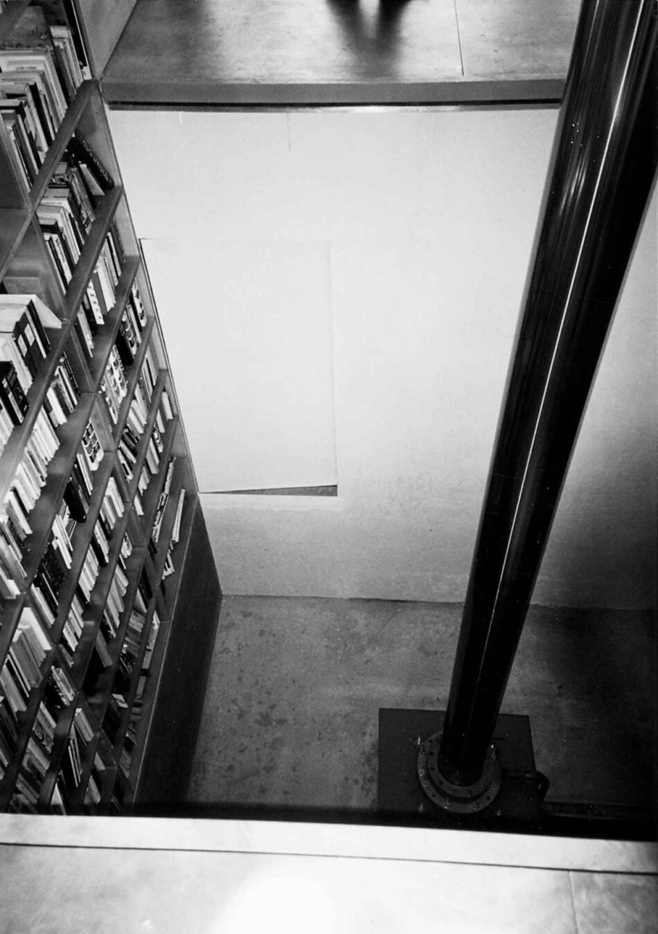
A day in the life: Early in the morning; after he has been lifted out of the automobile and placed in his wheelchair, the glass wall slides open, and he moves into the kitchen, passes the monolithic concrete stove, and slips behind his desk set in a lofty skylit space. Behind him, a sea-green resin bookcase goes up three stories. A knobless door opens into a dark cavern containing the bottles of claret. On the desk lies an industrial remote control device, a telephone, a newspaper, and a workbook for learning Mandarin. He pushes the remote control, and the room moves up; he slides past the bookcase. It is possible to stop at any point and take out a book—for instance, S,M,L,XL.
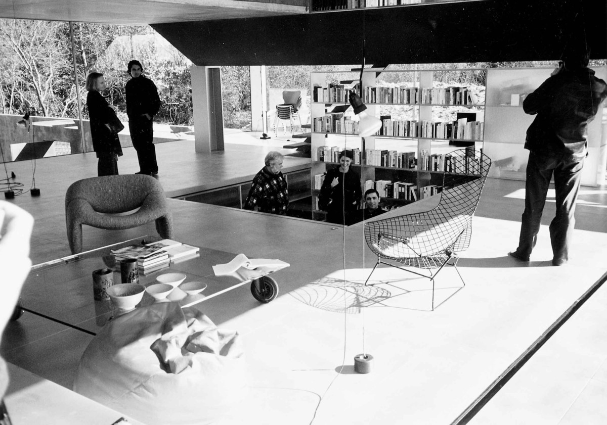
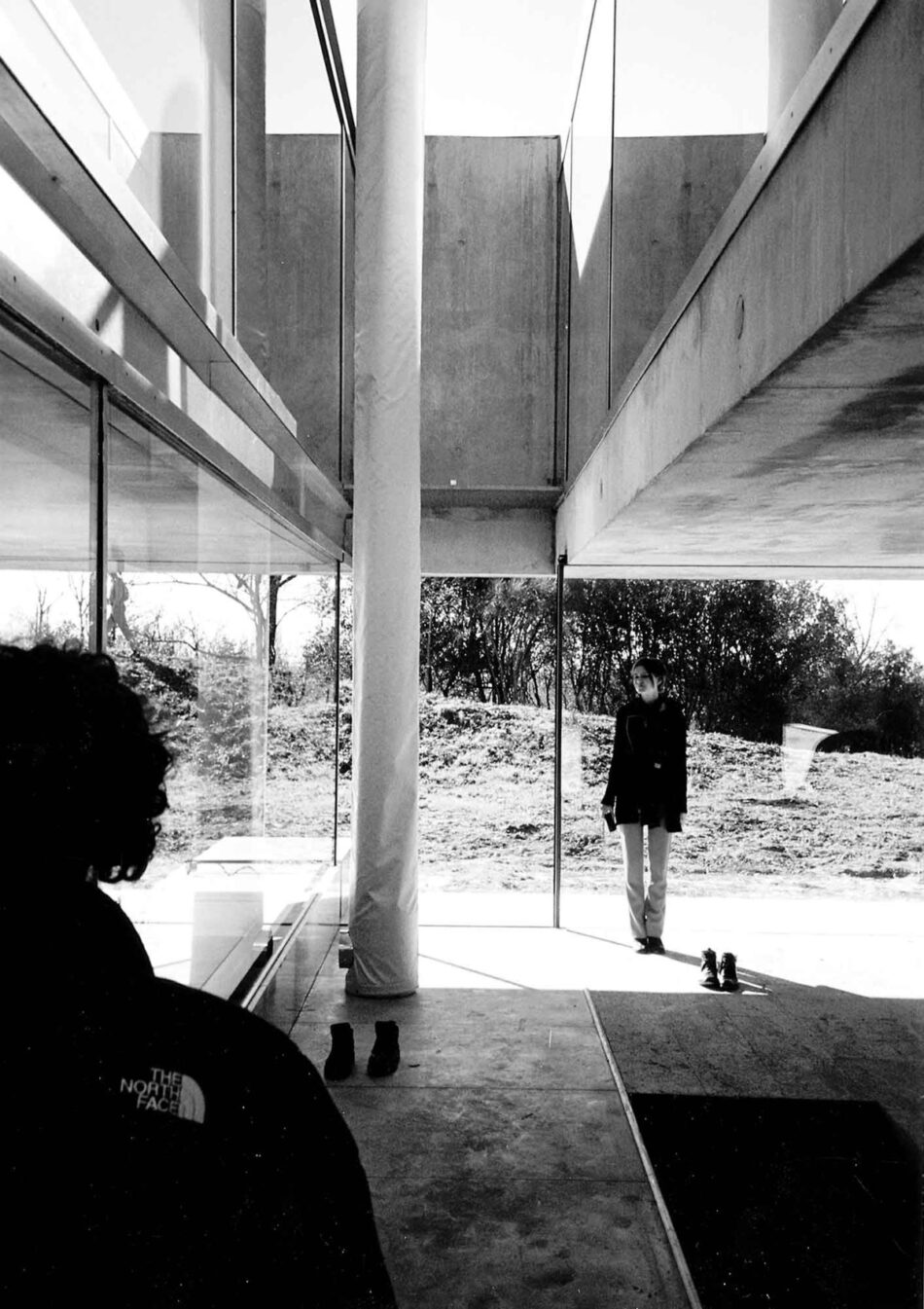
After a couple of meters, the room locks into the floor of a stunningly glassy glass house, the metallic floor flush with the hill. The man looks down into the parking space in between the perimeter wall; he looks the other way over Bordeaux and the river; he looks around and sees some furniture, and also a huge chromium cylinder and a thin rod, both connected to the big box floating above the living room. He drives off the platform toward the view, goes into the garden where the path burrows into the ground, and looks inside a flower. He drives back in, maneuvers himself behind his desk, and makes his room go further up. He locks into the third floor; through the bookshelves he sees the terrace. Next to him Gilbert & George’s “Lifehead” looks apotheotically skyward.
He moves away again and passes a number of physiotherapy contraptions, crosses the terrace, and goes into the master bedroom. His wife is still sleeping. He quietly passes the bathtub, goes past the white resin washing slab: a face floating by in the mirror. Back in his study, he sits a while behind his desk. One porthole in the wall is precisely positioned to give him a view of the horizon; another is aimed downward to give him a view of the hill. A therapist arrives and gives him a workout. His wife helps him get into a different wheelchair for his shower. The water disappears in the cracks between the floorboards. From where he sits with water running over him, he looks in the split separating the adult half of the top house from the children’s part and sees himself reflected twice in the glass. Then his wife dries him off and helps him into the hospital bed for a nap.
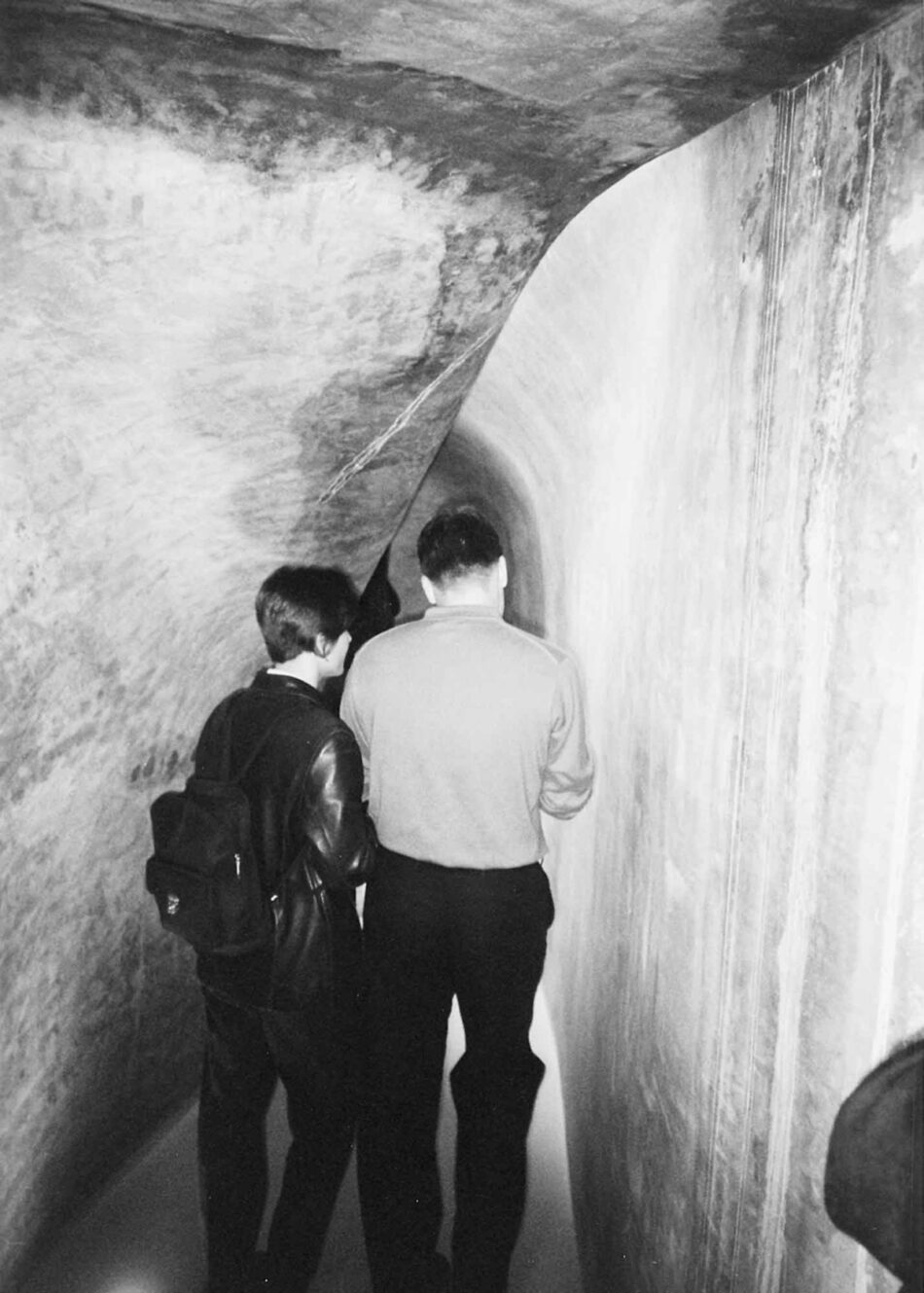
She takes a bath, gets dressed, and crosses the metal grate bridge between the two parts of the top house into the children’s quarters. This half of the box is divided by diagonally placed walls that strangely remind you of the folded door/walls around Louise Bourgeois’s children’s bedrooms at the exhibition and, like those, seem saturated with memories and nightmares. She wakes some kids, springs open some of the glass plates covering the portholes, and takes a medievally tight and dark spiral staircase—hidden in the chromium tube—down two stories into the TV room. She follows the curve of the wall into the kitchen, makes herself some coffee and a croissant, takes it back in front of the TV, and watches the Breakfast Show. She then gets up and enters a strange uteruslike staircase that takes her to the living room.
The Attack of the Haptic Experimentalists
However, in January 1998, Dutch architects Ben van Berkel and Caroline Bos published a critical article about Rem Koolhaas’s work in the magazine Archis, in which they set off Rem’s “semantic-analytical approach” against the “Haptic Experimental line taken by Zaera Polo and kindred architects” (which they also follow, as do Greg Lynn, Jeffrey Kipnis, Sanford Kwinter, et al.). “Now that the more experimental approach is rapidly on the rise—witness, for instance, Gehry’s Guggenheim Museum in Bilbao—it is feasible that Koolhaas’s influence may decline in the coming years.”2 There are two extremely peculiar ideas in this little quote: first, to hoist poor old Frank up on the table and make him King of the Haptic Experimentalists; second, to prophesy a backlash against Koolhaas by starting it. This is why they stress the feasibility of Koolhaas’s decline instead of its possibility.
It is no wonder that as soon as Rem Koolhaas broke up the quasi-theoretical limbo in which even his built work seemed to linger, and his work could no longer be seen as diagrams, models, or icons of his or anyone else’s writing, the rift between him and his Haptic Experimentalist counterparts opened wide. The economy of avant-garde architecture in American universities requires a certain homogeneity of writing, design technique, and architectural form. But Koolhaas seems to have abandoned this. His jumping off the bandwagon is a gesture that can be taken as an omen for some radical changes in the critical landscape of architecture and thought, changes that maybe not everyone can adapt to. A decline in the influence of Rem Koolhaas would at this point perhaps be comforting to the Haptic Experimentalists. (But whether trying to effectuate this decline is the best way to secure their future remains doubtful.)
The harsh criticism by Van Berkel and Bos is partly fallout from the ANYhow conference in Rotterdam in the summer of 1997, where Haptic Experimentalism tried to manifest itself as the new avant-garde with a non-manifest manifesto, hesitatingly read by Sanford Kwinter. Koolhaas then launched repeated attacks against the introverted formalism of this group. “The line” taken by Haptic Experimentalism is that there can be real life, or real intelligence, or real excitement in the morphogenesis or emergence of form brought about by experimental design techniques, computers, datascapes, mapping, etc. H.E.s even go so far as to say that architects’ thinking lies entirely in the semi-autonomous design process: in the model, the computer screen, or the crayon on paper.
To people who are not theosophically or otherwise mystically inclined to believe that there is intelligence in the semi-autonomous production of blobs and lines inside computers, it is hard to find any thinking at all in the architecture of Haptic Experimentalism. As becomes apparent from Van Berkel and Bos’s article, the line holds that Rem Koolhaas applies techniques like folding and collage so rigidly that they remain “verbal constructs,” and only “acquire three-dimensional identity at a much later date.” The only way to define the “future importance” of Rem Koolhaas’s oeuvre is to subject it to a formalist research, to divorce the “formal manipulations” from the “verbal constructs.” The hypothesis seems to be that when OMA buildings are not surrounded by Rem Koolhaas rhetoric, they will appear not to be so interesting after all.
Picking apart Van Berkel and Bos’s novel approach to Koolhaas helps us to focus on the tragic and morally uplifting beauties of the villa in Bordeaux. First, Van Berkel and Bos’s argument that Koolhaas uses collage and folding in a rigid way means that they understand content and visuality as architectural form, as is indeed apparent from their own work. They see even the Paranoid Critical Method as a historical architectural motif having to do with form. As classic art historians, they present a set of stylistic attributes, call these formal manipulations, and designate these as the critical center of the oeuvre. In other words, Van Berkel and Bos place the identity of the work in the way the design techniques become directly visible, much as Bernard Berenson located the identity of the master of a 15th-century panel in the brushstroke. This was an important part of Berenson’s theatrical performance as the connoisseur and the basis on which he could sell the panel to American art collectors. Maybe a similar way of thinking about architecture also makes sense to the Haptic Experimentalists, as a basis on which to sell their particular avant-gardist styles to state universities.
Second, saying that Rem Koolhaas’s architecture is semantic implies that he uses signs to denote . . . well, that which is denoted. How can we understand this? Is the moving platform a sign for the crippled man? Is the superpositioning of the houses a sign of collage, of superpositioning things? Is the house a sign of living? Is the whole design a three-dimensional diagram of a linguistic formula denoting the life of the family? I think not. Just because the Paranoid Critical Method is expressed in language and is also implemented in architecture does not mean that the architecture is a piece of language. And because the house presents itself and is presented in terms of program does not mean that the house denotes the program.
What makes the house is that it is a bit of world in your face; the world is neither denoted, as Van Berkel and Bos imply, nor broken down into data and fed into an interiorized process of formal manipulations, as is the case in designs by Van Berkel and Bos and their fellow H.E.s. The world has become architecture, not by abstraction but by inclusion or rather intrusion. To put it in the terms of the great theoretician of form and believer in the real, Gilles Deleuze (a philosopher often quoted by H.E.s), the fact that the guy is crippled, or rather that a car crashed, is the “difference that is given,” the “intensity” that “actualizes the virtual form” that is the house: a form that did not, even as a possibility, exist before.
Gary Bates, architect at OMA, confessed that when he saw the house for the first time, he was “fucking scared, because it raises the stakes even higher.” It does. It raises the stakes of how far OMA dares to let the real in. After this house the world cannot as easily be censored before being let into architecture: radical-chic caricatures of life can no longer be so easily translated into formally inventive masterpieces. It is one thing to present innovative architectural ideas against the backdrop of Far Eastern statistics and an ever-expanding, ever-progressing generic metropolis. Engaging the small, the personal, the painful and the sad, and doing it beautifully, is another thing. Here is an architecture that has more to do with steel spiders, broken bodies, and children’s bedrooms than with its own vocabulary of form or with a parallel universe of imminent hypermodernization. During ANYhow, Rem Koolhaas asked Greg Lynn: “Are you a mystic?” We eagerly ask Koolhaas: “Are you a humanist?”
“. . . une condition trés . . . ahum, ahum, ahum . . . intéressante,” the voice booms in a big brick warehouse, between broken bodies swinging suspended from the rafters and immense steel spiders loitering around children’s bedrooms. Above, in the galleries surrounding the big space, are tight phalanxes of youth concentrating on television sets, themselves being watched over by severely dressed art femmes. This is not the new Metallica video. Rem Koolhaas is giving a lecture at the opening of the OMA exhibition “Living,” in the Centre d’Architecture Arc en Ríve in the Musée d’Art Contemporain de Bordeaux, which is currently running a show by Louise Bourgeois, the French artist responsible for some of the most unsettling images in contemporary art. A thousand people have shown up. A hundred are sitting in the actual lecture hall; the rest have to make do with televised Koolhaas. The exhibition features four villas and an apartment project, all of which have been built and are lived in. The main feature, the reason that the place is teeming with foreign critics and curators and French politicians, is to be found somewhere else.
For that you have to leave the building, take a left, follow the heavy traffic to the north over the quay, where the cars, trucks, gas stations, and discotheques are incoherently juxtaposed against the elegant Louis XV sandstone river front. Then take the bridge over the river; follow it for a couple of kilometers, drive inland through a sprawl of identical suburban houses and industrial buildings; take a winding road up the leafy hill until you reach a private dirt road that brings you further up. To your left lies a pasture with a ruin of an 18th-century tempietto, behind it an elegant neoclassical mansion, and in front of you, on the top of the hill, a reddish brown box punctured with holes. On top of the box lies an I-beam that sticks out on one side and is connected to the hill by a spidery steel rod, making the box look like a balloon tethered so it won’t drift away on the wind. As you come closer, the box appears to hover over a cut stone perimeter wall. The dirt road is carved into the hill and burrows its way underneath the wall into the courtyard.
The gradual unveiling of OMA’s long-awaited “Maison Bordeaux” reaches its climax here. As a model, the house was published a couple of years ago. The model can be seen in the exhibition, but now the house can be visited with the architect and the client. Later, at a “right moment,” OMA—displaying the fastidiousness about images that seems to be an unavoidable part of architectural dinosaurdom—will allow the world to see a small selection of glamor pics, bringing even more visitors up the dirt road. But now, this afternoon, there is the extraordinary opportunity to see for the first time what the real house looks like and simultaneously be there.
But if the whole sequence of events resonates with house, living, being there, and other similar feelings of closeness to architecture, then why, at the vernissage, does Koolhaas lecture about China’s nonspecific, non-architectural, far-away, depersonalized, non-authentic, quantity-based, not-there post-urban conditions? Why does he sardonically state that in China architects produce ten times as much, ten times as fast and do it ten times as cheaply as their European counterparts and therefore can be said to be a thousand times as good, and say this at the opening of an exhibition of projects that have taken an ungodly amount of design time, for small fees, only to make something desperately unique, utterly authentic, personal, and seriously Architectural?
Does this have anything to do with the post-S,M,L,XL Remchasm between practice and theory? With the fact that right after finishing work on the big book, Koolhaas took a teaching position at Harvard on the condition of not having to teach design, so he could undertake huge fact-finding expeditions into the Pearl River Delta, Shopping, and Africa? After the meshing of seeing, writing, designing, and building in his baroque gem of a book, he now imposes a stark distance between writing about things and making things. The concentration on making hyper-specific buildings and the obsessive curiosity about the world are now presented as two separate, sometimes conflicting fields of action. This is a dramatic departure from the formula that has made this architect a star: by letting the descriptions and readings of Manhattan, Singapore, or Lille meld with urbanistic designs or even architectural objects, a kind of architectural and theoretical parallel universe was created: Remworld, paranoid-critically coherent, accessible, imitable, exciting.
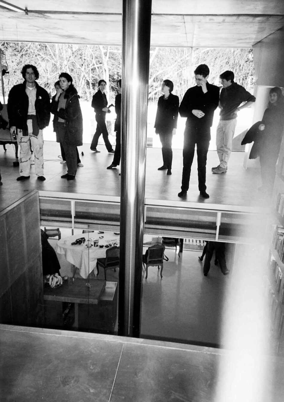
Well, kids, Remworld has shut its gates! You are invited back to reality, back to life. The stuff happening in Shenzen, Sudan, or a shopping mall is there, for real, completely unaffected by our or anyone’s interpretation. At the same time, the projects that are presented are not the models of a semifictional urbanoid future, but are here, now, in your face and under your arse. The discrepancy between the two destroys any hope for a coherent philosophical, methodological, or even narrative system out there that might connect them. We have hit rock bottom. Now it’s for real.
Now she is surrounded only by huge glass walls; she slides away some of them and walks over to the end of the metallic floor, where she looks out over smog-covered Bordeaux. In the middle of the living room is a big square hole with a hydraulic steel shaft supporting the platform, which is now locked into the top house of the house. Through the hole she peers into the kitchen. She walks back behind the bookcase where her desk stands. She settles down to look at her e-mail; the wires of her PowerMac sway in the wind. After a while, when the children are all ready, she rushes up the concrete stairs glued to the bookcase and wakes her husband. He and the children will leave for the afternoon; she will receive the architect and a group of guests who are extremely impatient to inspect every nook and cranny of her home.
The house demonstrates the Paranoid Critical Method as a radical way of deploying the heat-oppressed brain in architecture. Explained in (pop)Kantian terms, the P.C.M. can be understood as a psychologically charged relationship between the world as it exists by itself, regardless of whether there is a human observer to interact with it—noumena—and the world as it appears to us humans—phenomena. Koolhaas’s Paranoid Critical glare makes the noumena acquire such an obsessive intensity in the way they manifest themselves in the brain of the beholder—as phenomena—that they can be turned into architectural facts and returned to the world as new noumena loaded with fear, love, disgust, angst, ennui, lust. The reality of this family has become hyperreal in architecture. The product is what we might call a concentration of phenomenally noumenal phenomena, or noumenally phenomenal noumena.
Wouter Vanstiphout is an architectural historian and one of the founders of the Rotterdam research and design firm Crimson. Together with Cassandra Wilkins and Michael A. Speaks, he is editor of Dutch Moral Modernism, forthcoming from 010 Publishers.
