The Tower: An Anachronism Awaiting Rebirth?
Is the tall building an anachronism? Does it, like sprawling suburbia and out-of-town shopping malls, seem doomed to belong only to what is increasingly referred to as “the oil interval,” that now fading and historically brief moment when easily extracted oil was abundant and cheap? The answer is probably “Yes,” particularly for the conventional freestanding, air-conditioned, artificially lit tower that guzzles vast amounts of energy and is built for short-term profit out of high-embodied-energy materials, many of them petroleum derivatives. Such buildings are utterly contrary to the requirements of times of increasingly insecure and dwindling oil supplies, in which even the United States must one day embrace the quest for more sustainable lifestyles and forms of development. Energy-wasteful buildings also offend values held by more and more people.
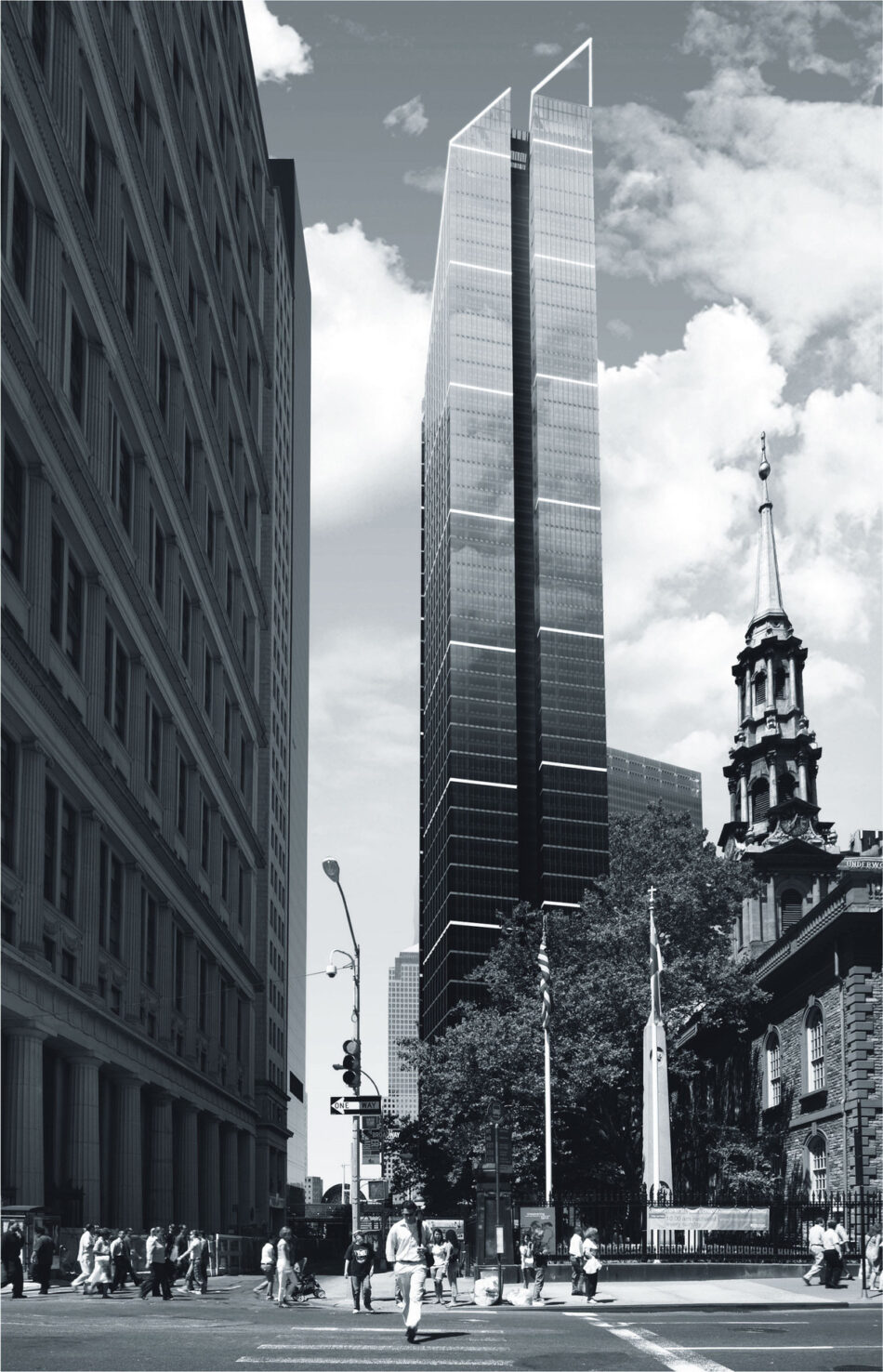
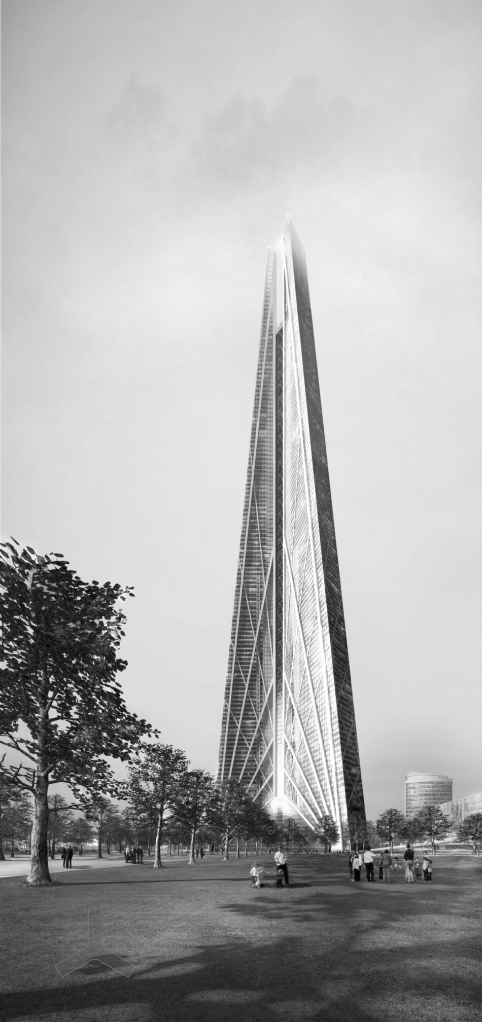
Nevertheless, such buildings continue to be built, and more are proposed, particularly for boom cities like Dubai and many in China. Yet the contrived sculptural forms and vulgar flashiness of so many of the towers there and elsewhere suggest rather desperate attempts to enliven a tired and dying type. Even towers by superior architects, like Norman Foster and Richard Rogers, proposed for the Ground Zero site in New York, seem vapid. And the gigantism of towers proposed by Renzo Piano for London and Foster for Moscow register as brutally intrusive and inappropriate. All these seem last-fling sunset effects from a waning era when, beside the defects listed, towers helped create dismal cities and aptly symbolized their extreme economic and social inequalities.
But ironically, the green agenda and quest for sustainability, the death knell of these kinds of towers, might reinvent and reinvigorate the tall building. Reaching up into fresh air and abundant daylight, tall buildings cry out to be naturally lit and ventilated, bringing energy savings, healthier conditions, and more personal environmental control. Touching tall buildings is abundant ambient energy in the form of sunlight and wind, only a little of which needs to be harvested to serve all their energy needs. Various European architects are now investigating towers that accelerate wind past or through them to drive turbines and towers big enough for water- and waste-recycling systems, with “gray” water from hand-washing use to flush toilet, and even “living machines” processing sewage on site.1
The best green towers, which combine high technical performance with a vibrant social dimension, may cost more than conventional towers. (Architects working on these buildings say they cost more only because they are more often high-spec developments with ample communal spaces.) The cost of proportionally longer and more complex external walls, often in several layers incorporating sunshades and upward-reflecting light shelves, can offset the diminishment of a building’s mechanical plant. Yet such buildings pay for themselves in lower running and maintenance costs, and if they are workplaces, the extra costs are recouped by having more content and productive employees.2
Urban arguments for green towers are constructed around their intensive use of the increasingly scarce resource of land. Towers clustered around transport terminals or interchanges facilitate commuting by public transport, while in compact mixed-use clusters, commuting becomes optional. The towers themselves could contain a mix of uses, some cross-subsidizing others such as affordable housing for key but low-paid workers (nurses, firemen, etc.) and low-rent startup units where the wealth-generating businesses of the future might germinate.
In retrospect, the post-Miesian tower, the mono-functional rectilinear vertical extrusion clad in dark or mirrored glass (which proliferated around the world in the second International Style era of the ’60s onwards) marks architecture’s all-time nadir, even if some examples were well detailed and proportioned. Modern architecture’s reductive utilitarianism and narrow rationality reached a squalid extreme, not only limiting all the complexities of inhabitation (which include cultural and psychological dimensions) to those observable as function, but here reduced yet further to mere gridded layouts. Such towers were efficient in the narrowest sense, maximizing the ratio of net lettable to gross floor area and minimizing the area of external envelope in relation to lettable floor. The quickness of their construction minimized building and interest costs but ignored long-term running costs, including those of energy consumption. Identical floors of minimal ceiling height were merely stacked for tenants to subdivide and fit out. Sealed off from the daily and seasonal cycles of the distant outside world, comfort was assumed to lie in stable conditions of mechanically tempered air and harsh fluorescent light. Architectural creativity was reduced to choosing an “off-the-shelf” curtain wall and the finishes in the lobbies. The abstract forms, flimsy thinness of cladding and partitions, and sleek surfaces offered nothing for body, psyche, or intellect to experience and enjoy; and often the broad expanses of anonymous open-plan layouts brought inside the inhibiting social protocols of the outdoor realm (when one sees too many people, one looks at none).
The urban consequences were equally dire. Withdrawn from the street edge so no stepped profile of setbacks would spoil their sleek verticality or would slow construction, each tower rose in mute isolation from what was, even when cosmetically paved or planted, dead residual space. The place-making spatial containment of the street was destroyed along with anything that resembled civic urban fabric, especially in the downtowns of widely spaced towers standing between whole blocks of surface car parking, as was quite common in the U.S. Sense of place evaporated, and the towers’ similarity—reflecting no particularities of city, climate, or culture—flattened out the differences between cities and countries. Built to make the most of expensive sites, these buildings wounded cities, leaving them dead, dangerous, and depressed in land values.
The gross inefficiencies of pursuing too narrowly defined “efficiencies” soon became clear, particularly with the oil-price shocks of the 1970s. Hugely wasteful of energy, these towers became expensive to run. When computers came, the limited floor-to-ceiling height prevented installation of raised floors for cabling and upgraded air conditioning to cope with increased heat loads. When recession brought gluts of lettable office space, these buildings were vacated. Tenants moved to “inefficient” lower and older buildings with “wastefully” generous entrances, elevator lobbies, and atria that conferred a sense of identity and place, and a welcome contrast to office tower floors. Many unlettable “highly efficient” buildings were demolished without turning as much profit as anticipated—in London, if not elsewhere.
Antipathy to such buildings, especially in European countries with strong white-collar unions, led to alternatives, mostly in mid-rise developments such as Herman Hertzberger’s Centraal Beheer (Apeldoorn, The Netherlands, 1967 to 1972) and Niels Torp’s SAS Headquarters (Stockholm, 1988), both of which internalize the convivial, community-forging urban realm now missing outdoors. Postmodernism, or the short-lived style dubbed as such, brought a more pervasive backlash against bland and boxy towers, but the changes it engendered were merely formal and cosmetic rather than spatial and functional. The interiors remained equally deadly, perhaps more so with the continuous perimeter glazing replaced by small windows and the populist gestures of pediments and pilasters supposedly compensating for tacky materials and details. But at least Postmodernism brought formal variety, sometimes with attempts to be “contextual” and return some identity to the city; and it attempted to reinstate the street with podia stepping forward to edge the sidewalk. The current fad for icons contributes less: The sculpturally expressive exteriors exacerbate the fragmentation of the city, and the interiors remain equally dismal but now more difficult to partition. An instructively striking exception is Piano’s Aurora Place (2000) in Sydney: Its curving sail-like facades signal a relationship with the spinnaker-like roofs of the Opera House, helping the city cohere and reinforcing its horizontal connection to the harbor waters while engaging sun and wind, forging a connection between city and sky.
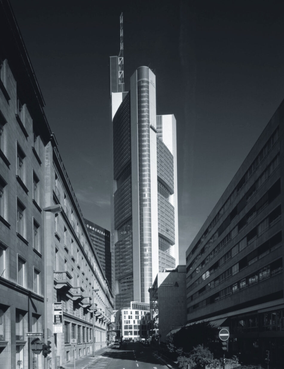
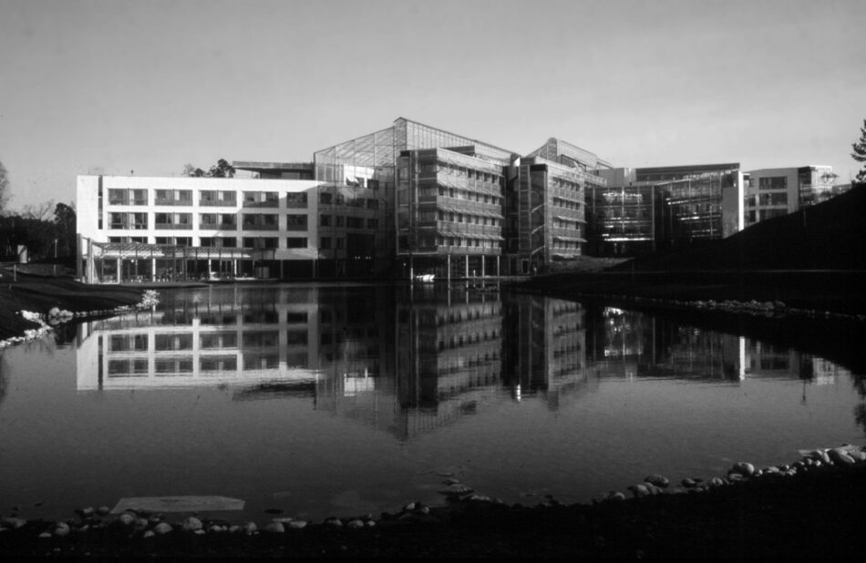
Now green architects are breathing new life into the most ungreen of building types, minimizing energy consumption (in time probably making them self-sufficient in energy use, even generating the excess to compensate for embodied energy), and providing the setting for an enhanced quality of life. This latter is both part of the promise of the green agenda and essential if it is to be readily adopted. The first convincingly green tower remains the most truly seminal: Foster and Partners’ Commerzbank in Frankfurt, Germany (1991 to 1997). Like most green towers built so far, it is a mixed-mode building—naturally ventilated and lit through most of the year but with backup ventilation and heating systems for summer and winter extremes—designed to cut energy consumption by what was cautiously predicted to be 30% but is proving to be 50% that of a conventional building.
Yet the design delivers much more. Spiraling up the tower, bringing light and fresh air into its hollow core and the offices facing it, are sky gardens that give striking identity and views to the interior and that are being used for casual meetings, coffee breaks, or quiet lunches. These are part of a hierarchy of social foci that bring a vibrant quality of life and community, foci that also include meeting areas in the middle of each arm of offices and the ground-floor, glass-roofed plaza, with its restaurants where employees may mix with the public and friends, or colleagues from another, adjacent Commerzbank building. This larger social dimension has proved a sound economic investment. Though the building was not expensive for its volume, this total volume considerably exceeds that occupied by its offices. The additional cost is made up for many times over by happier building users who are less often absent and less likely to leave their jobs, and whose salary costs soon amount to several times the construction costs of the building.
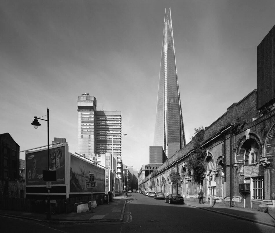
Foster’s next milestone in green tower design is 30 St Mary Axe in the City of London, built from 1997 to 2004 for Swiss Re and again designed to cut energy consumption by up to half that of a conventional tower with its cubic feet.3 The buildings for Commerzbank and 30 St Mary Axe offer instructive comparison. Both were commissioned by clients who occupy them and so gain far greater long-term benefit from a green design than would conventional developers. There were further incentives for building green: Frankfurt’s municipality made it a condition for granting permission for a tower, and Swiss Re, a reinsurance company, is in the business hit hardest by massive payouts for climate-change-induced “natural” disasters.
The design of both buildings started from rotating an initial plan concept. That of Commerzbank is a V forming two arms of an equilateral triangle, with offices facing both directions from each arm. These Vs are stacked and rotated 120 degrees at every fourth floor and thus create a prismatic tower with a hollow core and spiraling four-storied sky gardens. The corners are structural shafts containing vertical circulation and services, between which span the Vierendeel trusses of the window walls that support the column-free office floors. The corners of the shafts are rounded, and the outer trusses curve out slightly to ease wind flow around the tower and gain some of the rigidity of a tube. Fixed panes of glass, with ventilation gaps left at top and bottom and Venetian blinds behind the glass, intercept wind, rain, and direct summer sun outside the openable windows of the outward-facing offices. The windows of the inward facing offices draw in air that has come through the sky gardens into the central shaft, the height of which is interrupted by glazed diaphragms to prevent strong stack-effect updrafts sucking air out of the offices.
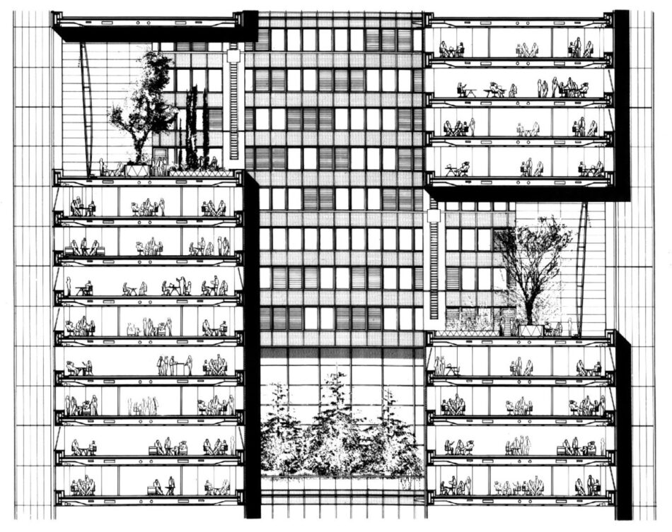
Commerzbank’s interior offers a vision of what the energy-efficient, socially convivial office tower of the future might be. Although a tower, it rises from a base that maintains the block pattern and cornice height of the surrounding older buildings and contains publicly oriented uses that vitalize the area. But because generated by the spiraling stacks of V-shaped floors, the form of the tower terminates somewhat arbitrarily and clumsily. 30 St Mary Axe is also generated by a plan that is stacked and rotated, but this varies in size so that the freestanding tower has a sleekly unified form that tapers in tightening curves to its crowning dome.
30 St Mary Axe’s conceptual origin was the circular plan. Enclosing maximum floor area for the length of curtain wall, this form obtrudes least on the piazza it rises from, allowing views and pedestrian flow around its base. The circle also minimizes wind resistance and thus also turbulence and downdrafts, while the differences in air pressure around it drive the natural ventilation system. But circular plans allow little flexibility of subdivision, and so six V-shaped notches were removed to create a series of petal-like, almost rectangular areas that can be subdivided and laid out on a five-foot grid. Each floor was then rotated five degrees so that the wells created by the notches spiral up and around the building. Portions of the tinted single glazing of these wells open to admit and exhaust air sucked up or down them by the differential air pressures outside. (Like the central shaft of Commerzbank, the wells are closed at regular intervals, here every six floors, to prevent excessive drafts.) In turn, this suction draws through the office areas air that has been admitted through horizontal slits in the clear glazed multi-layered curtain wall and then guided up through grilles in the floor. In extremes of heat and cold, when the opening sections of the spiraling wells are closed, these same grilles admit mechanically assisted and tempered air. The system has been designed so that in interim periods individual petals can receive mechanical back up of this sort while the rest of the building remains naturally ventilated.
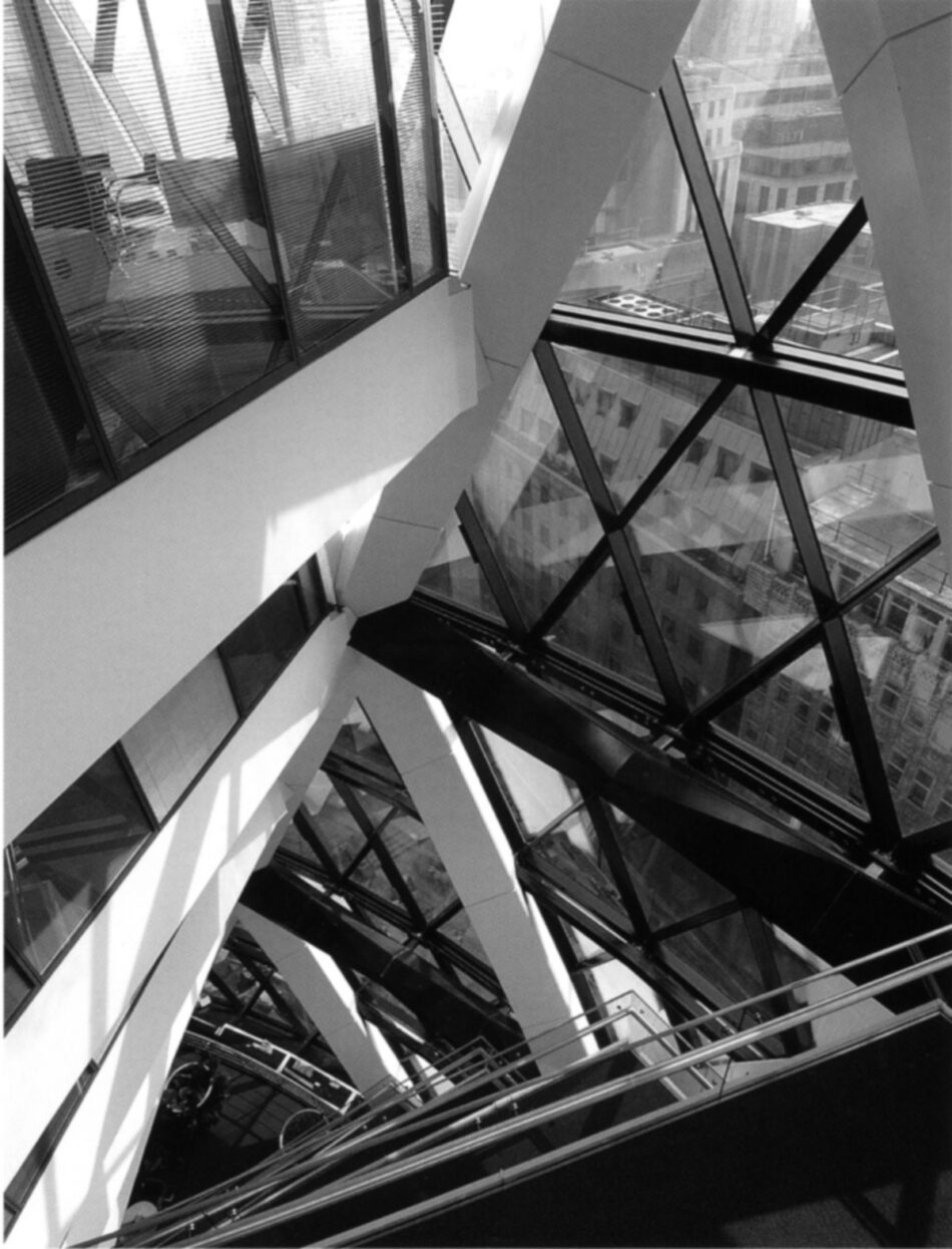
Taking cues from the spiraling wells, the structure is a diagrid of columns spiraling in both directions and held in place by ring beams at every second floor. An extremely strong and stiff frame, it required 20% less steel than a conventional structure4 and is rigid enough to require no mass damper. Moreover, because the core takes no wind loads, it diminishes in area as groups of elevators terminate with height, thus compensating for the smaller total floor area and keeping a relatively efficient net-to-gross ratio.
Despite its complex geometry, 30 St Mary Axe was built at costs similar to or lower than those of other London towers. This was made possible by the building’s materially efficient circular form and by Foster’s practice of customizing parametric modeling software for each such project to guide design development and to be shareable with the engineers, contractors, and subcontractors. For initial bids, contractors and subcontractors (such as the steel fabricator) were not issued drawings, only a document outlining the rules generating the geometry. They then had to submit spreadsheets charting the spatial coordinates of all structural nodes, so architect and engineer (Arup) could check whether the contractors understood the geometry. The computer model then guided manufacture of components and construction, eliminating the accumulated errors that can accrue when one is working with drawings and facilitating extremely precise construction.
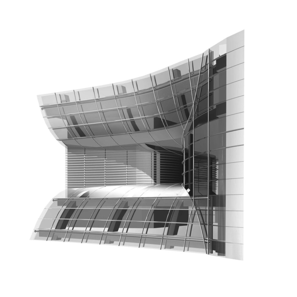
An example of the daunting geometric challenges solved by the parametric model was devising the shapes of the pressed steel jackets that snugly clad the slanting cylindrical columns and their fireproofing. The columns extend straight through two floors (the module of the diagrid) while the enclosing jackets follow the geometry of the glazing panels with a smaller module that changes sectional alignment four times through the same height. Yet the cladding jackets, which basically form a symmetrical four-sided figure in plan section, also shift in radial alignment with the building’s center and so must twist slightly, this being achieved with a slight diagonal crease.
Technically, formally, and geometrically, 30 St Mary Axe constitutes a considerable advance on Commerzbank, though it lacks the latter’s sky gardens and hierarchy of social spaces. Inside, because of the V-shaped slots, the offices floors do not seem mere horizontal slices of space; they offer even those sitting some distance from the multilayered external wall slanting views to the street and the sky. (Originally the exposed triangular ledge on each floor was to be planted as a breakout and meeting space, visible to the floors above and below as an invitation to join. Though this idea was dropped, its correlate of locating cellular offices along the other side of the well, where they don’t obstruct views through the perimeter glazing, has been realized.) The spaces under the dome at the top—a restaurant and bar for the use of employees and their guests only—offers even more dramatic views of London. Yet for all its advances and sophistications, not least in breathing like some organism through its skin and spiraling lungs, 30 St Mary Axe retains the key faults of the modern tower: It is freestanding, acontextual, and forbiddingly glacial. Commerzbank seems the better springboard to the future.
A caveat about mixed-mode buildings combining natural ventilation with air-conditioning: The great efficiencies predicted are realized only with the optimal use of the buildings and their systems. Automatic controls linked to sensors facilitate optimal performance but, in the spirit of the green ethos, occupants can override them. Typically the buildings do not initially perform as well as predicted and do so only as the computerized “building management systems” fine tune themselves and occupants learn how to make the most of them.5 Rigorous monitoring has been confined to low-rise green buildings: In the first year, performance is often disappointing, but by the third year it can surpass expectation. A post-occupancy study of Commerzbank proved that it is outperforming predictions: Because people prefer natural ventilation, they stick with it at temperatures above and below those expected.
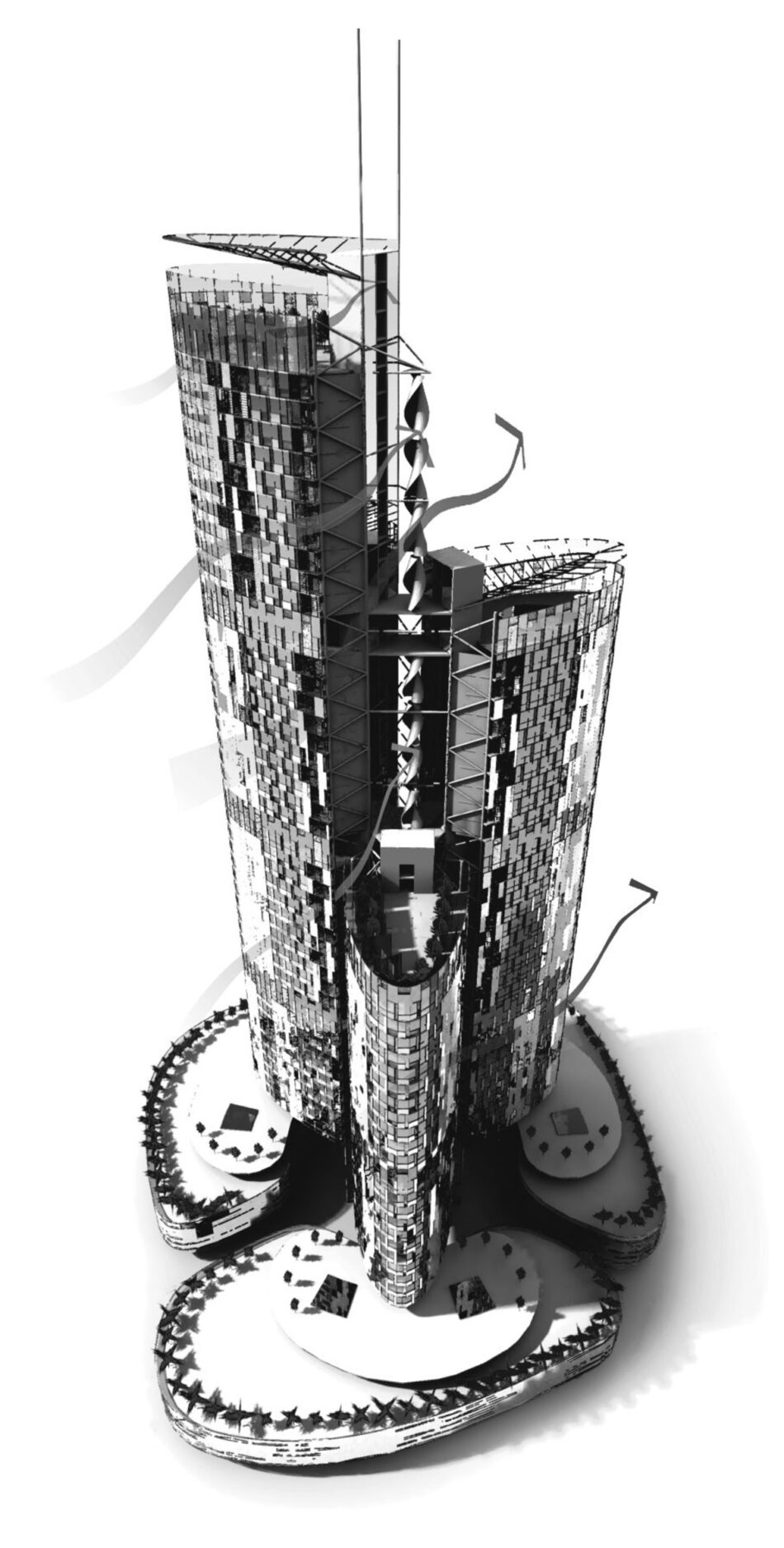
The next big step forward will be towers that generate all their own operational energy (such energy autonomy is already being achieved in some residential buildings). Although technically possible, that is not yet economically viable with office towers that require energy-intensive chilling because of heat produced by the electronic equipment and admitted through the fully glazed envelopes if the automatic controls on the sun-shading blinds are overridden. Office towers also need a lot of electricity for all the equipment they contain, the larger number and higher performance of elevators than residential blocks have, and myriad other electric motors powering various automated systems. Proposals for energy self-sufficient residential towers include Marks & Barfield’s Sky House and Bill Dunster Architect’s SkyZED “Flower Towers.” Both accelerate wind past vertical turbines in slots between wings of the buildings and, like Commerzbank and 30 St Mary Axe, have curved corners to minimize turbulence. Because it can as much as triple the energy output of the turbines, “wind focusing” like this is certain to become common.
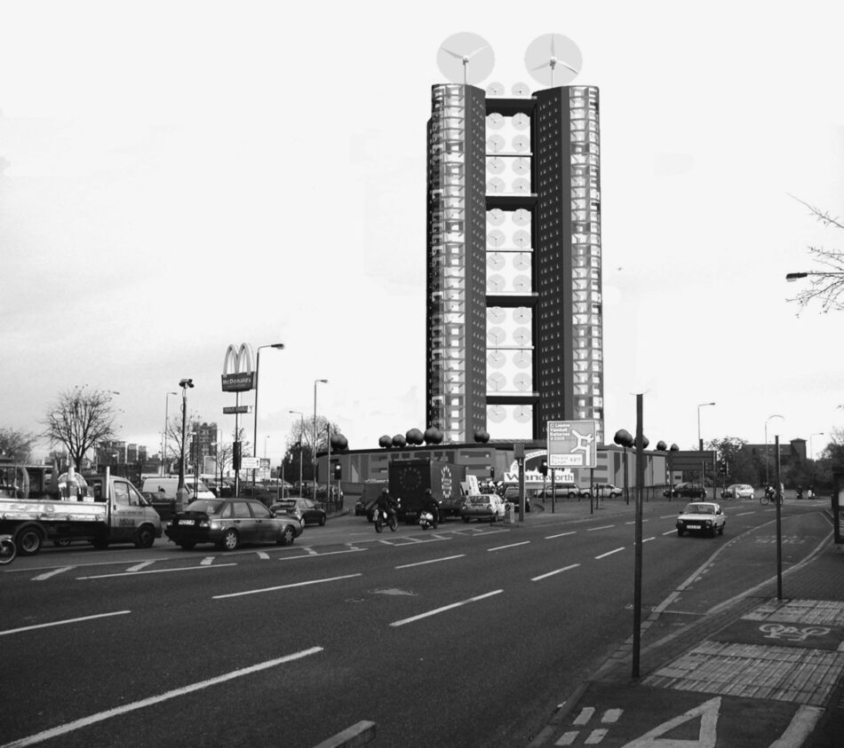
Combining rigor with constant research and innovation, Dunster has consistently set new milestones in green design, building a number of low-energy developments and even some generating zero CO2 emissions, as at the seminal BedZED in south London, a hybrid of a housing and business estate.6 A typical Flower Tower is one designed for a traffic roundabout in Wandsworth, London. Its two thirty-five-story, bean-shaped wings of flats and duplexes focus the wind on a series of vertical turbines in the slot between them. Also in this slot are the elevators reached by bridge-like lobbies every fourth floor, with grassy playgrounds on the roofs around the turbines. Publicly accessible workspaces and commercial units ring the base of the tower, and on its sixth floor are community facilities. Turbines and photovoltaics provide all electricity, but heat comes from a biomass boiler. A “living machine” processes all grey water and sewage. Yet though the Flower Tower suits its problematic site ringed by constant traffic, it is usually difficult to marry wind-focusing schemes with a socially satisfactory urban grain.
Clearly then, although towers have been synonymous with and symbolic of waste, inequality, and coercively panoptic working conditions, they can be energy-efficient—even self-sufficient—and enticingly convivial places for living and working. The future of towers depends not on whether they can be green but rather on what kind of city and urban lifestyle will be required and desired in the future. In a globalized world, cities as much as countries compete for skills and investment, and do so in both available facilities and quality of life, to which the historic character of a city contributes much. Hence, for instance, Mayor Ken Livingstone’s conviction that London needs more towers in its historic center to consolidate itself as a global city might instead be precisely the way to compromise its competitiveness.
Currently corporations and finance houses demand very big towers in which to agglomerate all their staff, a trend it was widely speculated that 9/11 would reverse but has not. Yet a countertrend is emerging. Globalization initially moved industrial jobs to the lower paid developing world as the developed world entered the post-industrial, information age characterized by giant corporations offering services of various sorts. Now another wave of globalization is starting to move information processing tasks—from “back office” functions like accounting and administration, to legal advice and software development—to well-trained, lower-paid workforces in the developing world. The developed world is entering what has been called the Conceptual Age, its economy increasingly centered on creativity, culture, and the caring activities instead of physical or mental rote work.7
What kind of city nurtures this very different workforce that is in touch with and wants to live in accord with its deeper values? Ask people how they believe they should really live; the clearer they become about this, the more obvious it is that such a lifestyle is very difficult in the contemporary city. Do we want to live in a city of glistening towers, of spectacle and the restless excitement that fuels and is fuelled by excessive consumption? Or would we prefer a mid-rise city with a more finely grained, more intricately rich and varied urban fabric offering choice, contrast, respite, and surprise—a convivial city where community has a chance of being reestablished? Sustainability requires not only that we lessen our ecological impacts, but also that we create the urban and cultural frameworks in which we can attain full humanity, in contact with self, others, and nature. This might be the real reason that the tower seems an anachronism. There may be a few clusters of green towers here and there, but their presence might be limited in the compact and convivial cities of the future.
