A Cut, a Move, a Forest
Sometimes you can have your cake and eat it, too.
Great architecture is deceptively simple. In the late 1970s, James Wines, founding principal of SITE (the acronym for Sculpture in the Environment), was commissioned to design another retail store for the catalog merchant company BEST. This commission came as part of a fruitful collaboration that began in 1975 with the company’s Houston store, which gained immediate notoriety because of its crumbling facade. The new outlet in Richmond, Virginia, was to be located on a lot occupied by a beautiful patch of forest. There was, however, a conundrum to be addressed: Should the existing trees at the edge of the lot be conserved? Doing so would surely grant an ecological imperative to the project, one in tune with preoccupations of the moment, as well as facilitate approval from local stakeholders. On the other hand, for commercial enterprises, signaling one’s presence to the street via its facade is a fundamental tool for economic success, and the trees were located at a key line of visibility.
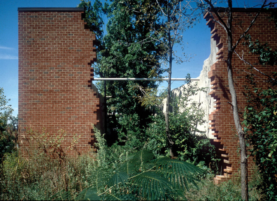
Wines ultimately came up with a very simple yet clever solution to the tree challenge: Why not just slice the building very close to its perimeter and shift the entire facade to the limit of the plot as a freestanding ruin, leaving the trees intact as a vegetal buffer and situating the usual box of the retail store behind them? Such a stroke of architectural genius was highlighted by a few elements: seen laterally, the treatment of the brick textures of the facade and of the retail box mimics the effect of a telluric force that could have actually pulled the building apart. The vegetation is also groomed to look rough and wild, as it grows in abandoned buildings. In the freestanding facade, normal glass windows augment the ambiguity of the design as a whole: after the threshold, one encounters a lush fragment of woods before entering the real building.

With just a cut and a move, Wines managed, almost magically, to enhance our sensibility of the trees. We see their foliage above the sturdy wall, which amplifies their presence as it arouses our curiosity to discover what is beyond. Upon passing through the facade, we find ourselves in an otherworld of shadow and greenery, which, only after the fact, was found to have a beneficial effect on the building’s overall energy consumption.
Although some engineering works were needed to redirect the roots, the project communicates that vegetation is precious and should be treated with care. Architecture therefore must adapt to its presence, even up to the point of being destroyed, and not the other way around, as with the current fashion of plants perched over buildings.
Architect Giancarlo De Carlo used to say that great architecture outlasts any program. Purchased in 2015 by the West End Presbyterian Church to hold its services, the 1980 Richmond building is the only BEST store designed by SITE that is still standing.
Fabrizio Gallanti is a Montreal-based architect and curator teaching at McGill University in Montreal and the Architectural Association School of Architecture in London. His current research analyzes the consequences of economic growth on contemporary Latin America. Together with Francisca Insulza, he is founding partner of the design and research studio
Fig Projects.
