30 St. Mary Axe
All of us, when we see a painting, are bound to be reminded of a hundred-and-one things which influence our likes and dislikes.1
—E. H. Gombrich
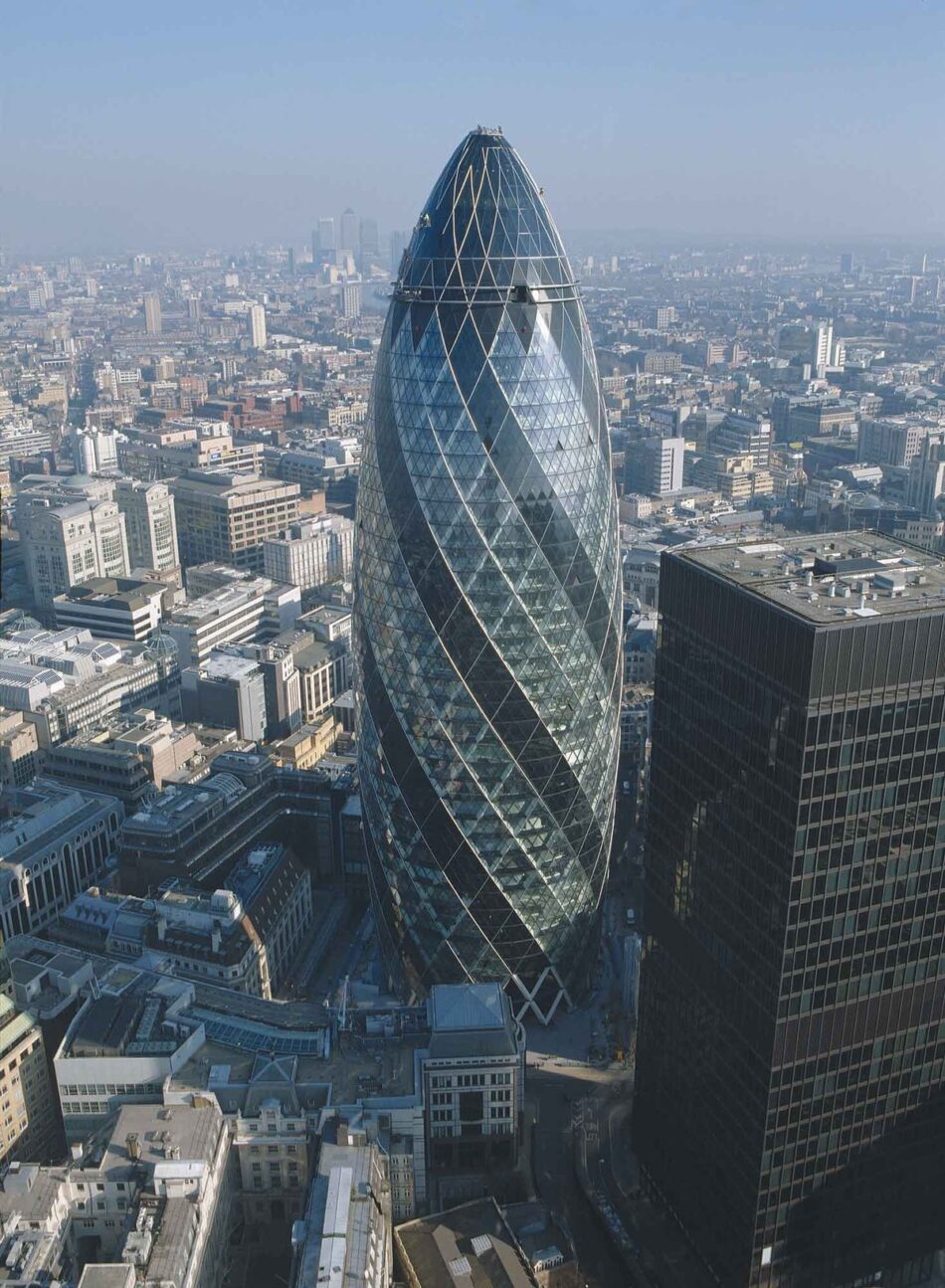
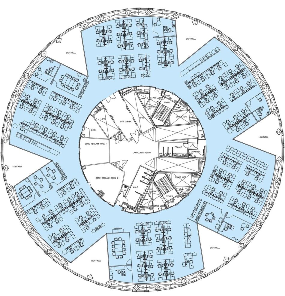
The Square Mile in the City of London is dominated by dry repetitions of the conventional office block—vertically extruded, horizontally striated—mingled with the weighty presence of its historical institutions. The “Gherkin,” as 30 St Mary Axe2 is popularly known, has a distinctive shape and circular plan that immediately set it apart from the orthogonal towers around it. The building’s extraordinary form leaves us bewildered as to what in the way of precedents or prototypes may have inspired it and what type of construction or functional requirements may have determined it. But on further analysis we discover that its utterly unique expression is the product of a complex of multivalent parameters, transversally interlinked through its physical assemblage in ways that deliberately contradict our expectations. The double-glazed, circular outer envelope incorporates a diagrid structural system, a single-glazed inner envelope, and asterisk-shaped floor plates. Each floor is rotated five degrees from the floor below, generating six atria in the form of triangular prisms that spiral around the building, admitting daylight and allowing for air circulation in the offices. It is in the zone between the single-glazed inner envelope and the double-glazed exterior envelope that the different elements imbricate and the expected outward expression of the building’s internal functions dissolves. This generates a kind of incomprehension, reducing the viewer’s perception of how the building works to speculation and technological fantasy.
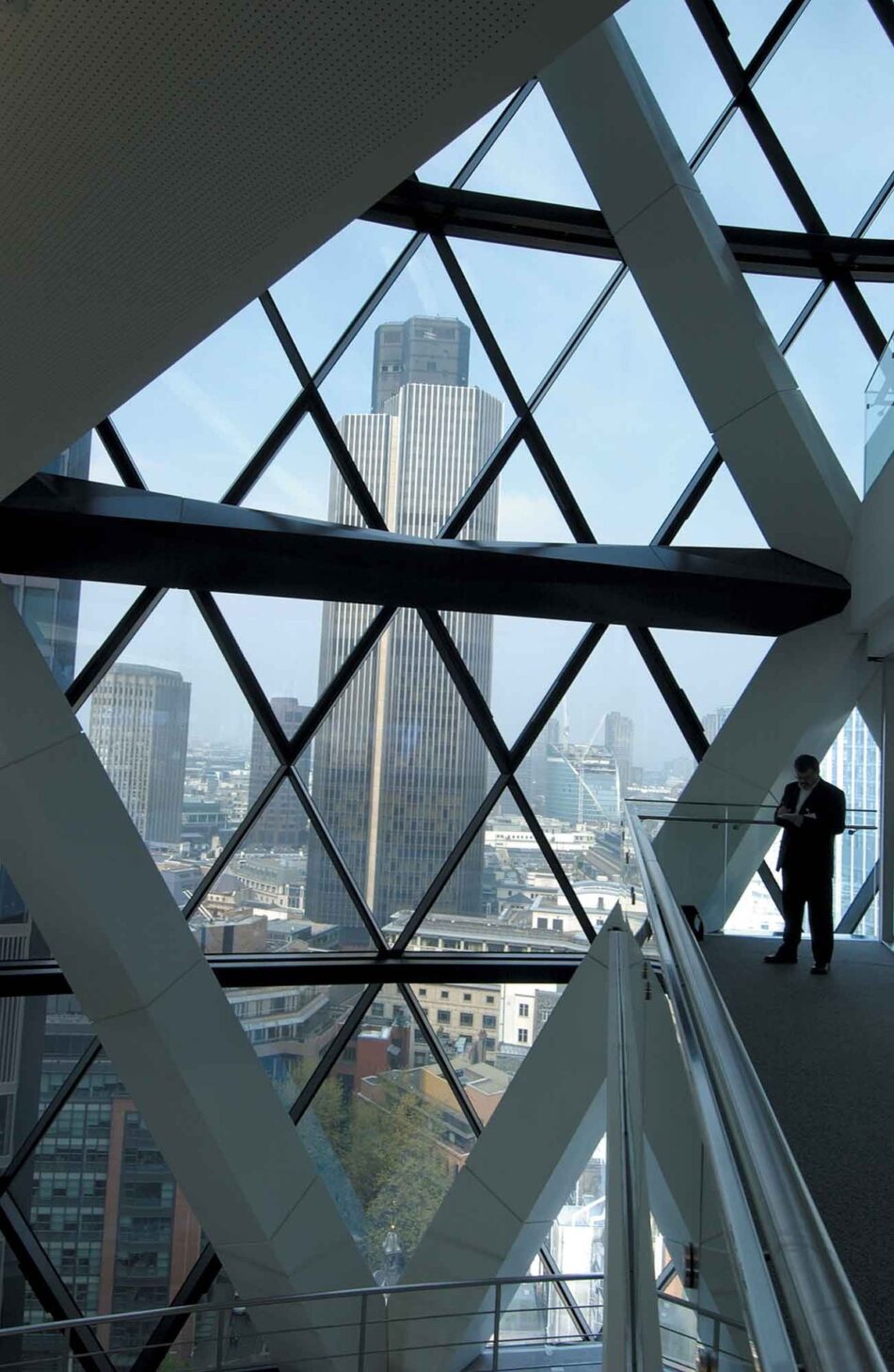
Vertical support for the building is provided by a series of intersecting, two-story-high A-frames that make up a steel diagrid structure that is highly efficient in resisting wind forces. Fire regulations required that these Aframes, composed of circular sections, be wrapped in fireproof aluminum casings. In the Hearst Tower3 in New York, the casings are the same shape as the structural sections, to express the working structure, but here they are kite-shaped in section, with the two pairs of adjacent sides unequal in length. This allows the outline of the structural sections to be stretched to connect directly with the thin, blade-like glazing mullions that project beyond the glazing panels and support the exterior glazed envelope. If the casings were rhomboidal, rectangular, or square, the structural members would not dissolve seamlessly into the glazing mullions. In addition, as the two longer sides of the casings are oriented toward the exterior, the depth of the visible structure is foreshortened, making it seem far more slender than it is and further distorting our perception of how it works. The encased diagonal members, placed end to end, are also painted white, while the horizontal crossbars are painted black. As a result, from the exterior the structure reads as a diamond rather than a triangular pattern, again obscuring our understanding of it.
This strategy of obfuscation continues in the interior. On the perimeter of every other floor, hoops encircle the building in line with the nodes or junctions of the diagrid members, counteracting the horizontal spread of the structure and binding the whole together. The kiteshaped profile of these hoops causes them to disappear next to the diagrid assemblage. In addition, the floors, because of their asterisk shape, touch the perimeter at only six points, so no continuous horizontal floor plates are visible on the exterior. They spring up along the facade, appearing and disappearing; when they do touch, they are camouflaged by the crossbars and perimeter hoops. Thus it is almost impossible to “read” the location of the floor plates—their presence is no more expressed than the thickness of the glazing mullions subdividing the large white diamonds.
Together, the diagrid and hoop structures of 30 St Mary Axe disguise not only the tower’s interior horizontal striation by floor plates but also its vertical load distribution. They form an exoskeleton that distributes vertical loads along the diagonal lines of the steel members, eliminating the need for columns in the interior. While it is undeniable that a column-free space offers many advantages, it seems unlikely, in the case of 30 St Mary Axe, that this solution was prompted by a desire to engineer the most efficient office space possible. After all, offices are more flexible when they can accommodate changing layouts over time, and neither a circular plan nor an asterisk-shaped plan could ever be as flexible as a square one, even if its six wings, by introducing rectangular segments into an otherwise round volume, make it easier to create cellular offices. The decision to combine a circular exterior envelope with an asterisk-shaped floor plan was in fact made as much for the sake of exterior optical effects as for efficiency.
30 St Mary Axe was designed not only from the inside out but also from the outside in. The requirements of these two approaches are, however, entirely different. Whereas column-free space, naturally ventilated offices, and breakout spaces are needed in the interior, the exterior has to provide open public space while mitigating the effects of the building’s large scale within its historical setting. The circular footprint of the tower is compact, maximizing the public realm at ground level and reducing the amount of wind deflected to the street. This compressed footprint bulges outward from the ground up, reaching its optimum floor-plate size on the sixth floor, and increases marginally as it approaches the twentyfirst, after which it tapers inward toward the apex. The result is a conical tower rather than a rectangular block, and this shape allows for the required amount of office space without overpowering the neighboring buildings, which are lower in height. Furthermore, compared with a similarly sized tower, 30 St Mary Axe appears infinitely more slender, yet the slight bulging and tapering also give it a sense of weight. Had the circular plan simply been extruded, there would certainly have been a sense of gravity but not of weight.
The play with optical illusions continues on the surface of the tower. Its conical envelope is clad in triangular glass panels that, owing to the curvature of the tower’s profile, are tilted either toward the sky or toward the ground. The panels reflect the light differently as the sun moves around the building, creating a flickering effect, and shimmering argyle patterns appear on the surface of the envelope. But the optical drama of the glazing does not stop here. Two different colors of glass panels are used: the areas fronting the diagonal atria spiraling around the building are wrapped in gray-tinted, high-performance glass, while the office areas are wrapped in clear glass with a low-performance coating. The gray-tinted glass was selected to reduce solar gain, but as it winds and twists its way around the bullet-like form of the building, it appears to spiral around its axis of gravity and lends the tower a sense of potential energy and acceleration.
The tower, in fact, makes it impossible for us to remain passive, as it presents us with a whole series of paradoxes. It transmits the sensation of heaviness but also of a delicate lattice, the sensation of verticality but also of twisting. It is fully glazed, yet instead of an affect4 of intangibility it transmits that of a tactile argyle knit. The sensation of conicality is unlike that of any other tower. The diagonality that is triggered by the spiraling strips of gray-tinted glass defies any sense of horizontal striation or the stacking that we commonly associate with towers. The lack of apparent correlation between the exterior argyle pattern and the interior offices renders it scaleless. And it is this multiplicity of affects that is so perplexing and that gives 30 St Mary Axe a dream-like quality. The twisting reminds us of roller coasters or the slides in water parks, or even Carsten Höller’s giant slide installations. The latticing reminds us of baskets or fishnet tights. The conicality reminds us of rockets or gherkins. The argyle pattern recalls Scotland, socks, Pringle, knitting patterns, intarsia, harlequin-patterned floors or furniture. It is no wonder that the Gherkin is only one of many nicknames that have been attached to this polysemic building.
Great buildings such as this one, however, have little to do with aesthetic populism. Instead, they take conventional architectural elements—shape, materials and size of the components, construction system, lighting, ventilation, acoustics, planning of activities—and assemble them in unexpected ways. In doing so, they transcend signification and meaning to generate new subjectivities. The multiplicity of affects that we experience at 30 St Mary Axe is very different from any we are familiar with. As an affective break with the conventional office tower, it is an example of an architecture of a-signifying semiotics5—not designed to communicate meaning but to probe our cognitive and social environment. It challenges our common sense, and this is what makes it so compelling.


