GREEN RECTANGLES
On April 1, 1986, Barbara Stauffacher Solomon delivered a lecture at Gund Hall at the Harvard Graduate School of Design on her proclivity for green rectangles, the wild gardens of California, breaking with modernism, and landscape as architecture as art. Solomon’s lecture came two years before the publication of her first book, Green Architecture and the Agrarian Garden, which grew out of her master’s thesis in architecture at the University of California, Berkeley. What follows is a transcript of her talk, edited for length and clarity.
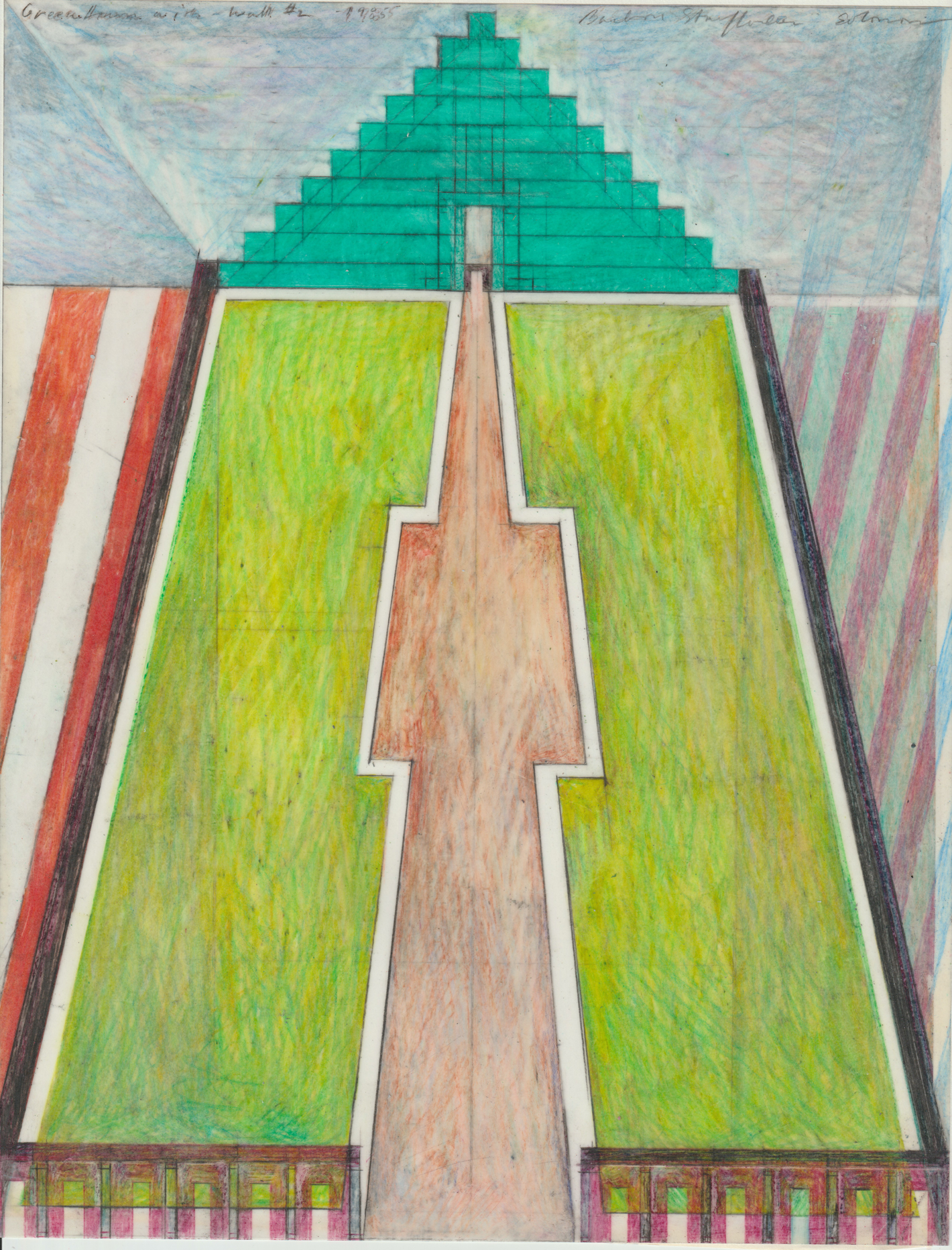
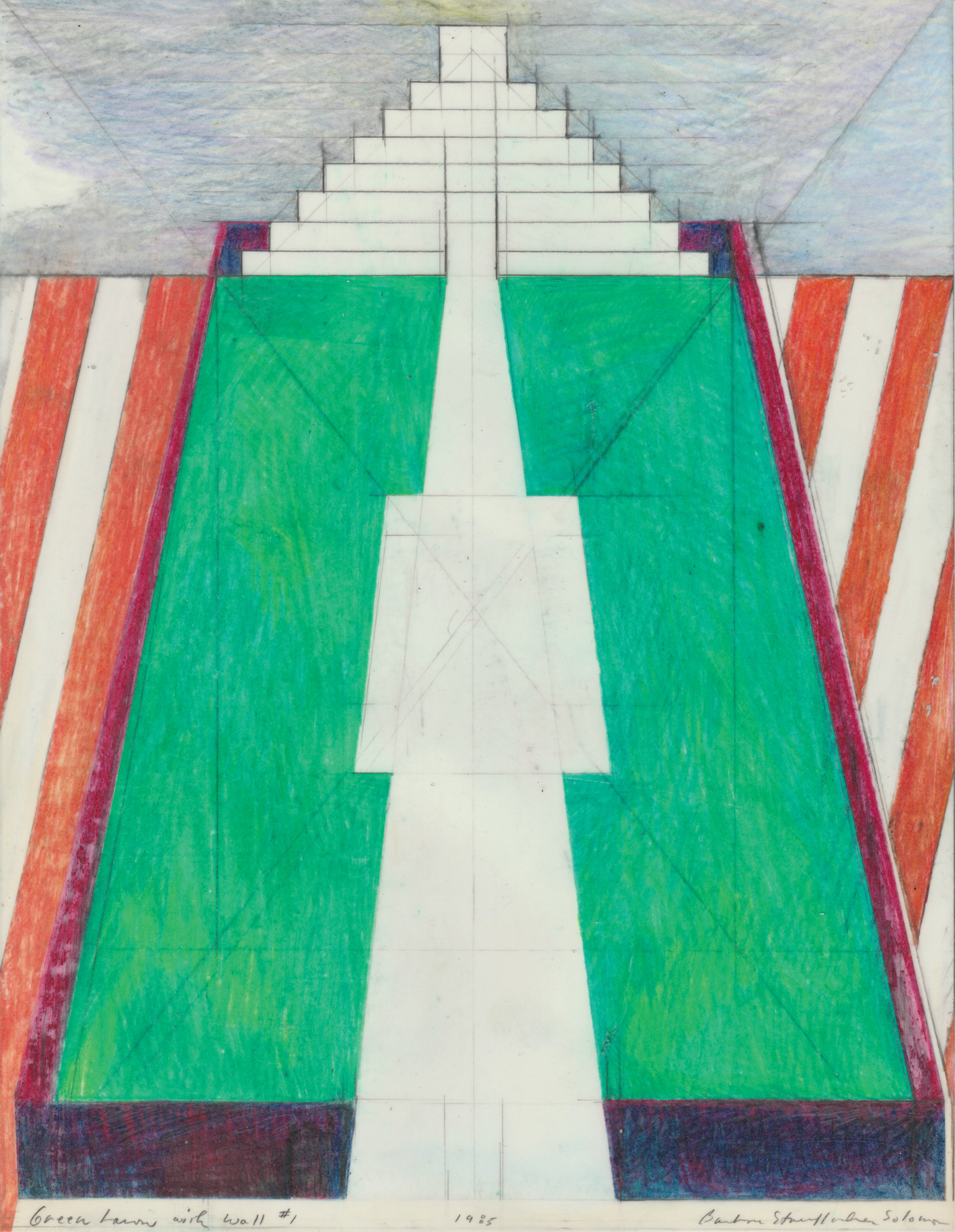
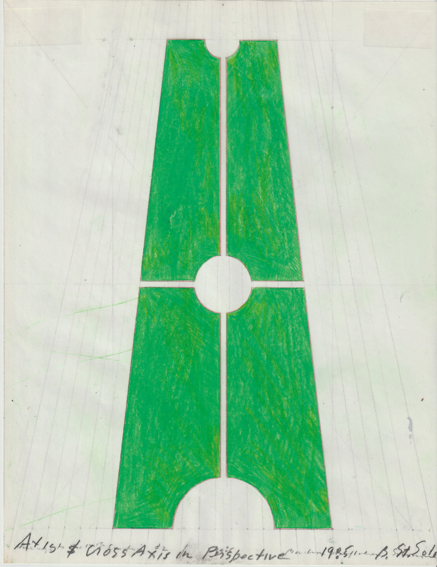
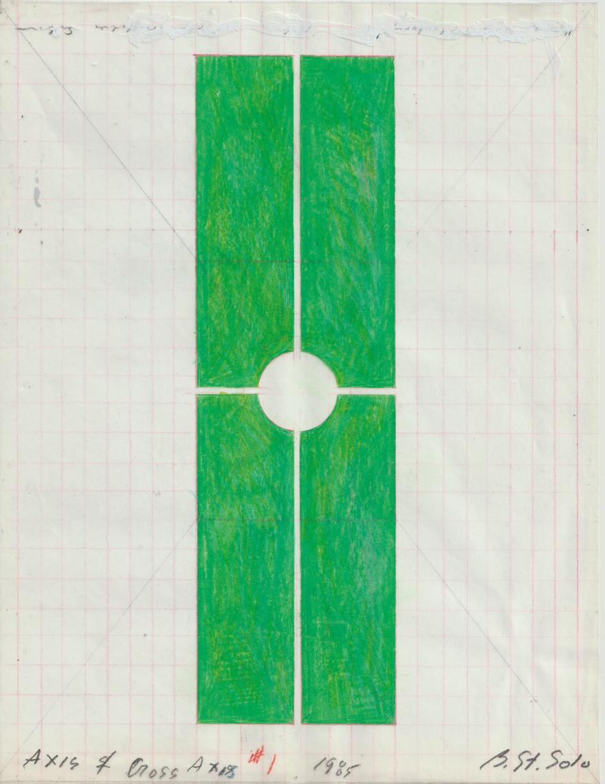
I have made much of green rectangles in my drawings and in my landscape designs. The green rectangle appears as paragon, paradigm, panacea, and paradise. The scale changes. Materials change. As drawings, they are layers of green pencil on paper with sharply cut edges. In landscape plans, green rectangles represent man-made nature—a grass playing field, for example, which is fairly inexpensive to construct and maintain and extremely usable. On architectural elevations, they show a wall with windows, doors made of vines, green tiles, paint, or glass.
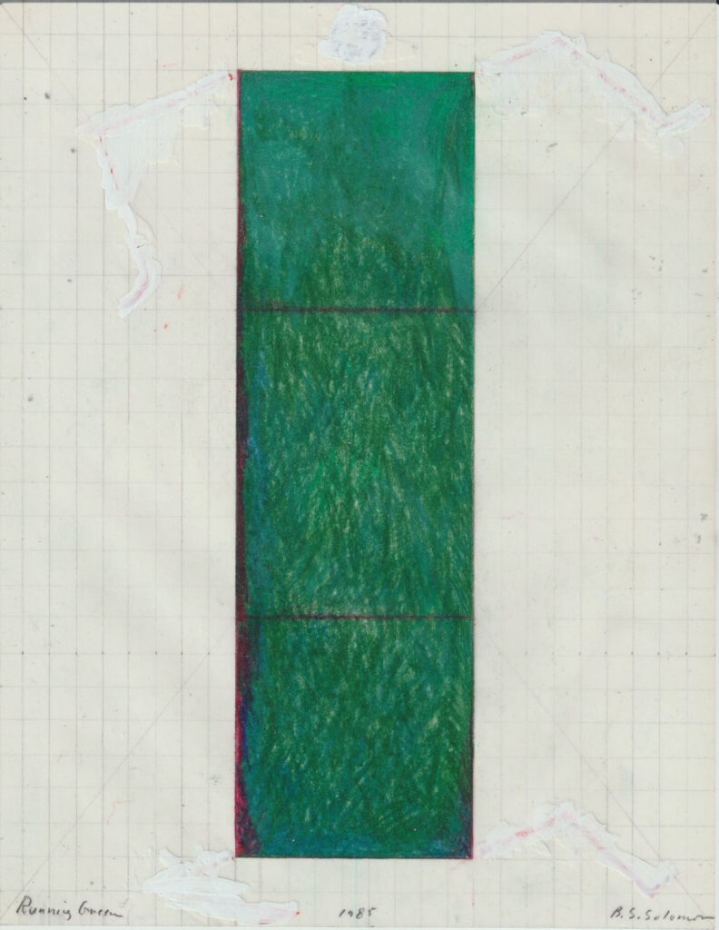
If I were a painter, I would cover a lot of rectangular canvases with a lot of green paint. Since I design things, some of which get built, my proclivity for drawing green rectangles necessitates my devising theories that advocate green rectangles as solutions for real projects. But since these projects rarely get built, the drawings are usually the things that are real.
Does one’s compulsion to remember and seek out and draw certain shapes on a piece of paper justify constructing landscapes or buildings that these shapes can be seen to represent? Is the piece of paper with shapes drawn on it—which happen to denote ideas about landscapes and buildings and cities—an end in itself, and therefore, a drawing as art? Or is the drawing a by-product of architecture, and therefore, a drawing for architecture?
If I were drawing buildings—built or intended to be built—would not the client, the site, the program, the materials, and the project budget take priority, resulting in drawings that are entirely different? I would probably not even be drawing most of them. They certainly would not look like the drawings I usually make. The drawings I made as I wrote the words for this talk gave me the excuse to draw more green rectangles.
What’s the reason for this green rectangle that I foist on almost everyone in every situation? I’m a San Franciscan. Both of my parents were born there. When I trace the lines of a map of San Francisco on a piece of paper, I walk on streets I remember. When I draw the opposite, leaving a white rectangle within a plane of green that extends to the edges of the page, I feel uncomfortable. If you cut a rectangle in the forest, it’s yours . . . but it isn’t mine. It belongs to someone living in Oregon at the bottom of a thick carpet of green, not to someone raised on top of a piece of land-filled water.
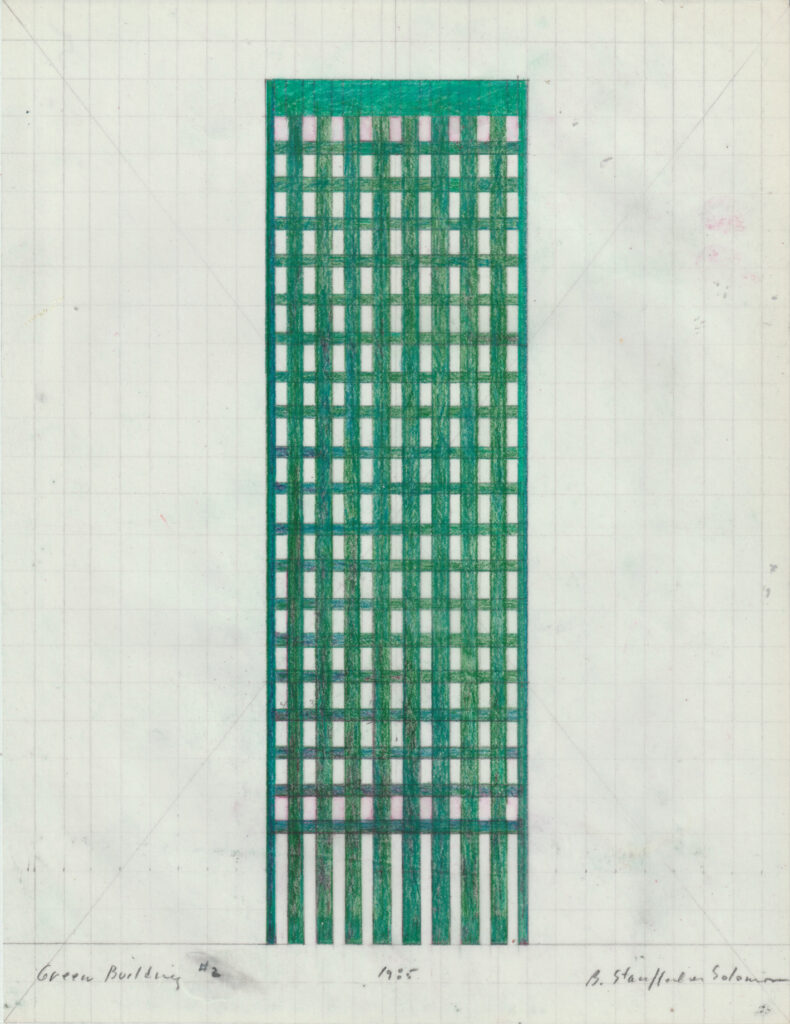
As a child, I lived by the Marina Green. It is a large rectangle of flat grass, bordered on one side by low buildings and straight streets ascending the hill, and on the other three sides by San Francisco Bay. A road goes around the green, but no paths or trees muck it up. It is a lot of nothing that is a lot of something. It’s someplace—the center of the universe—for all those people who begin before dawn to run and walk and sail from there. It is a big green rectangle on an edge of the city, which is the center of the city.
Some years ago, I designed a project adding another large green rectangle a few blocks west of the Marina Green: Crissy Field. Presently, Crissy Field is a parking lot. It used to be an airfield for the Presidio of San Francisco. The Marina Boulevard, bordering the Marina Green, now forks off to become an approach to the Golden Gate Bridge. In my project, the boulevard continues straight into the Presidio, leading to perimeter blocks of housing that continue the grid of the city. Traditional backyards merge to become green squares. There are parks with tennis courts, lap pools, and orchards. The Marina Baths terminate the project west of the site, and the Palace of Fine Arts is to the east. The Marina Baths would replace the destroyed Sutro Baths and resemble the conservatory in Golden Gate Park. Crissy Field would be a rectangle of grass with steps terminating gently in the bay. San Francisco would have another green rectangle to play on, and I would have another one to draw.
In cities these days, practically no one can afford to have very much space for dwelling, let alone a private playground. Public and semiprivate recreational gardens can provide some of that paradise lost. We in the cities are obsessed with nature and with paradise. In California, nature’s paradise is the recreational park. We use it to improve our bodies, incidentally our minds, and certainly our chances for immortality.
In cities, we can decide that a selected rectangle in the grid will be green. This piece of hallowed ground becomes particular, possessed, the garden. A piece of street too steep for cars is a garden. The tree is a garden. We plant a palm, and like the green rectangle, the palm—standing alone or in rows—surely leads to paradise. A semicircle of grass is a garden. We plot a path, enclose a lawn, order trees, and make the water rise. It is uncommon common ground mediating between the buildings and the uncontrollable landscape beyond.
That common ground is a green theater for playing and playacting. France is the land of green theaters. In France, green rectangles spread out across a field become rectangles in the eye of the person who sees them. Fields enclosed by walls of forests become pyramids of wheat, stone, or grass. As one moves past the field, one sees the furrows extending to become the formal parts of Marly, Fontainebleau, and Verneuil. This is the landscape of order, enclosure, and magic. Order is orientation and cultivation. Enclosure provides a sense of well-being. Magic is when illusion is reality and opposites merge.
We find a traditional way of making shapes on the land, which lead people from one place to the next, and which continue the green walls of trees with the white walls of buildings. This view admits that man-made landscapes are man-made, and acknowledges that these landscapes are planted in conjunction with man-made streets and buildings and cities for the use and pleasure of people. This was the way of making landscapes before designers chose to forget it, and it was based on how agrarians used the land, not on a style of decorating the land. It was a time when farms were gardens and there was an agrarian aesthetic.
Traditionally, Western agrarians cultivated the land in simple geometric patterns. Rectangular fields were cut from forests or enclosed by lines of trees. Straight furrows marked cultivation and led to porticoes and arcades. Orchards were planted in orderly grids. Man-made pools of water were round or square, and lines of trees reinforced streets, boundaries, and connections between buildings. Grids of vineyards and hedgerow borders followed an agrarian logic of the land. This traditional way of organizing natural materials—planted and built—was glorified in pleasure gardens, parks, and cities until after the 1720s, when it began to be scorned in favor of a different pictorial or painterly scenery that came to be referred to as “natural.”
The West—and here I mean what is imagined as the Wild West—is where gardens are supposed to look especially natural. They should look as if God had personally dropped each seed onto the post-construction site. This is the god who made the Sierra gardens and who smiles with infinite approval on the picturesque English garden and its subsequent outgrowth—English landscape painting. This god was for the rights of man and trees. He was eclectic and didn’t like rules. He was the god of Romanticism, in whose universe things were wild without trimming, in all the rich diversity of their natural shapes. The preference for irregularity, the aversion to that which is wholly intellectualized, the yearning for échappé into distant misty escapes, these were eventually to evade the intellectual life of Europe at all points.
Both of these views—the traditional and Romantic—were a novelty in their time. Together they became what a natural landscape should look like. Trees were as free as people should be, from the constraints of straight lines, too many rules, and objective order—the very image of modern man. It was nature that was supposed to look as if no one had ever pushed it around. Every person’s reward for successful revolt was a garden with a winding path and trees planted in wild array. This became the modern style for designing a garden.
The style for designing modern buildings, however, went in another direction. Architects were seduced by the machine, futurist dynamics, logical rationalism, and functional science. They loved reinforced concrete, steel, glass, elevators, motors, speed, the geometric aesthetic, and the social vision of factories and abstraction. A marriage was made, through which the social benefits of technological artifacts and houses and cities could be enjoyed without the burden of their old industrial evils, so long as they were surrounded by picturesque English garden wildernesses.
Such became the correct image of the modern landscape for the modern architecture of the modern movement. And there were certainly splendid prototypes to look to. Many carefully made, random, and manicured landscapes were excellent illusions of unspoiled, even-better-than-nature nature. It was possible for humans to design a landscape to give the effect that it had not been designed.
But what looked like an ideal marriage did not turn out to be one. When modern architecture married the picturesque English garden wilderness, an unfortunate schism was initiated. The plans looked all right in the drawing, but they didn’t work out as cities. Architecture was drawn by one person while the landscape outside the building was drawn by somebody else.
People move through trees and thresholds as easily as they behold them both together in a single glance. People who draw trees and thresholds, real or visualized, draw them with the same hand—everyone, that is, except architects and landscape architects. Architects and landscape architects have to draw their ideas before they can get them made. To facilitate this, a disastrous but convenient convention has been devised, such that a building is drawn by one person or group, with the building being circumscribed by a thick black line, at which point the drawing is handed over to another person or group (probably with everything inside the line obscured or removed) to draw everything outside the line.
Architects visualize and draw their buildings with one set of theories. Landscape architects, abiding an arbitrary black line drawn along the project’s existing contours, proceed with their own concerns. The black line demarcates a clean separation between them. Supposedly, such lines and what they represent are only seen on paper, but they seem to have made their mark on the built and planted world. The resulting drawings communicate an amalgam of ideas that are often contradictory, and they represent an approach that helped produce the modern suburbs and sprawling urban areas that no one is in favor of.
It is imperative that landscape architects and architects find a verbal and visual language through which they can talk and design together. And there is such a tradition. For the Renaissance architect Andrea Palladio, the garden functioned as an intermediary between the internal organization of the architecture and the open spaces beyond. He advised objective rules in planning the area surrounding the building that are based in the history of the region, not on whim or tricks.
Subjective display, for Palladio, was relegated to the interior of the agricultural villa and to some iconoclastic elements in the garden. There was a constant exchange between the architecture and the landscape. The landscape of the Veneto, Italy—where much of Palladio’s work exists—was historically one of cultivation, not decoration. The gardens were structured nature—green architecture. Following his lead, we can see a wealth of traditional elements with which to make a garden or landscape—a field of poppies, a row of trees leading to a house, trees viewed against the sky or reflected in a pool, trees shaped by nature or by humans, a procession of green pyramids stepping through a meadow, a green doorway to enter a forest, and always allées. Poplars enclose a rectangle of water at Sceaux. Water encloses a square of grass at Dompierre. And in the American West, there are similar, simple solutions—a village green, an arbor, a boundary (or allée) of eucalyptus, an orchard of palms, processional or twin palm trees proudly announcing the presence of a home, the relentless grid of vineyards that carpets the Napa Valley.
These traditional classical landscape elements are in the Western inheritance of humanism and cultivation. Architects and landscape architects can both use its objective rules, geometry, proportions, symmetry, reduction, repetition, and clarity. It provides a shared wealth. A shared myth and magic between building and land, and with the people who will play out their lives in these environments.
And this theory . . . all so that I can draw more green rectangles. A way of drawing has led to a theory of landscape. Or has walking on the Marina Green and in the fields of France led to a theory justifying a way of drawing? Not only is there a chicken-or-egg relationship between my drawings of green rectangles and my words advocating for them, there is a duck-rabbit relationship in the drawings.
I produce drawings that stand in an ambiguous position between landscape and architecture and art. This is not a new problem, but it’s a timely one. When abstraction and the modern movement ruled, ambiguity was easily avoidable. Content in art was out. The artist who drew something knew he was wrong. History in architecture was out. The tradition of architectural drawing was out. If the architect drew at all, he knew his drawings were of no value compared to the functioning building. Obviously, though, some modern artists—Picasso, Matisse, Klee, and de Chirico—were concerned with content. And some modern architects—Schindler, Le Corbusier, Frank Lloyd Wright, and Louis Kahn—did not throw away their drawings.
Modernism and two world wars may have cleared out history, museums, and cities, and as a result made room for purer forms and white walls. But everything got so clean that it all disappeared. The few isolated high points that rose in this thin air hardly nodded to each other. Architectural objects tried not to be recognized and didn’t recognize the streets below them. Art objects didn’t talk to anyone who couldn’t dematerialize enough to float up to their heights.
Now everyone wants to get things messed up again. Artists want to imply the world back into their objects through metaphor, representation, and symbol. Architects want to put memory, illusion, and the street back into their buildings. Some artists deal with ideas of nature and life in the big city. Some architects draw fantasies they know will never be built.
For me, this break with the modernist dictate began in the early 1960s at the Sea Ranch. In 1964, I applied colored paint, symbols of the Pacific Ocean, large words, signs, and hard-edged (though still abstract) shapes directly onto the sacred walls. White walls. Architecture and art were nestling up. Architecture and landscape were next. By 1974, I was drawing landscapes growing out of the forms of the buildings, and buildings connected with landscapes. The paintings on the walls were big. The drawings—though of large-scale projects—are small. Most of my drawings, like a lot of other things, reduced down to 8.5 x 11 inches.
In the classical architectural treatises, drawings were pattern-book illustrations of what to build and how to build it, with text. Plans, elevations, and sections are the basis of everything. Perspective drawing introduced a new view in the Renaissance. Axonometrics, introduced in the 19th century, go in and out of fashion.
But from 1945 to 1970, architectural drawings were in low repute in the profession, as well as outside it. In the 1970s, the architect Jorge Silvetti said something like, “What do architects do? They draw. That is all they do. What can architects be sure of? They cannot be sure of having their buildings built. And if built, they’re not sure that the program will result in a place that they really want to have.” Silvetti wanted to see a resurgence in architects’ energies, without shame, and with lots of pleasure in cultivating the imagination and creativity that make the architectural drawing a moment without which architecture could not exist. And it happened in the last 10 years or so. History returned to architecture and to art. And with its return, the architectural drawing regained its former stature.
Architects have always taken ideas from artists. Now artists, searching for new ways to try to say what they want to say—now that they want to say something outside art again—are foraging in architectural territory. Traditional conventions of architectural drawing have provided artists with methods of visual codification, and since some artists’ drawings look like those done by architects, curators and collectors have become more inclined to recognize architectural drawings. Other artists making land projects of architectural scale and economic proportions have prompted landscape architects to desperately try to make their works look similar. A lot of these drawings look alike, but the polemics are different.
There are drawings for architecture—drawings by people who call themselves architects, of buildings intended to be built and that are built; drawings intended to be built but are not; and recently, drawings by architects who specifically do not want to build. There are drawings by architects who are more important than their buildings, more known than their buildings, and more real than their buildings. There are architects who paint and call their paintings “architectural drawings,” but the polemic is architecture. There are also drawings as art—drawings by people who call themselves artists, and drawings of constructions intended to be built and that are built. These are paintings by artists representing architecture as an idea, which in turn, represents other ideas. The polemic, however, is art.
I mostly just draw—cities, landscapes, and trees. Trees as a single image, or as a wall. A wall of trees that make a shape of the sky. In the Campo Marzio district of Rome, the buildings shape the sky to reflect the streets. Roman hilltops have a view on the world, but in the center of the city there are no horizons. Monuments block vistas. Heavy cornices compress the air and cut the light into long, tight rivers. The sky becomes a precious commodity. Needing this rare light, Romans have persistently cut clearings to catch the sky’s brilliance. The city is a network of inhabited walls that enclose shapes of sky. Mirror images of the streets below. Green nature in the city.
Born on the edge of the Pacific, I like a lot of sky. In Rome, I saw it in places where the streets were pushed open, even to a green rectangle. A drawing can try to show a building from the inside out—what you know and have read about and cannot see. A drawing is more than just being there. A drawing can try to show the place as the architect and original client conceived of it, what historians have written about it, and the way it felt walking through it last winter.
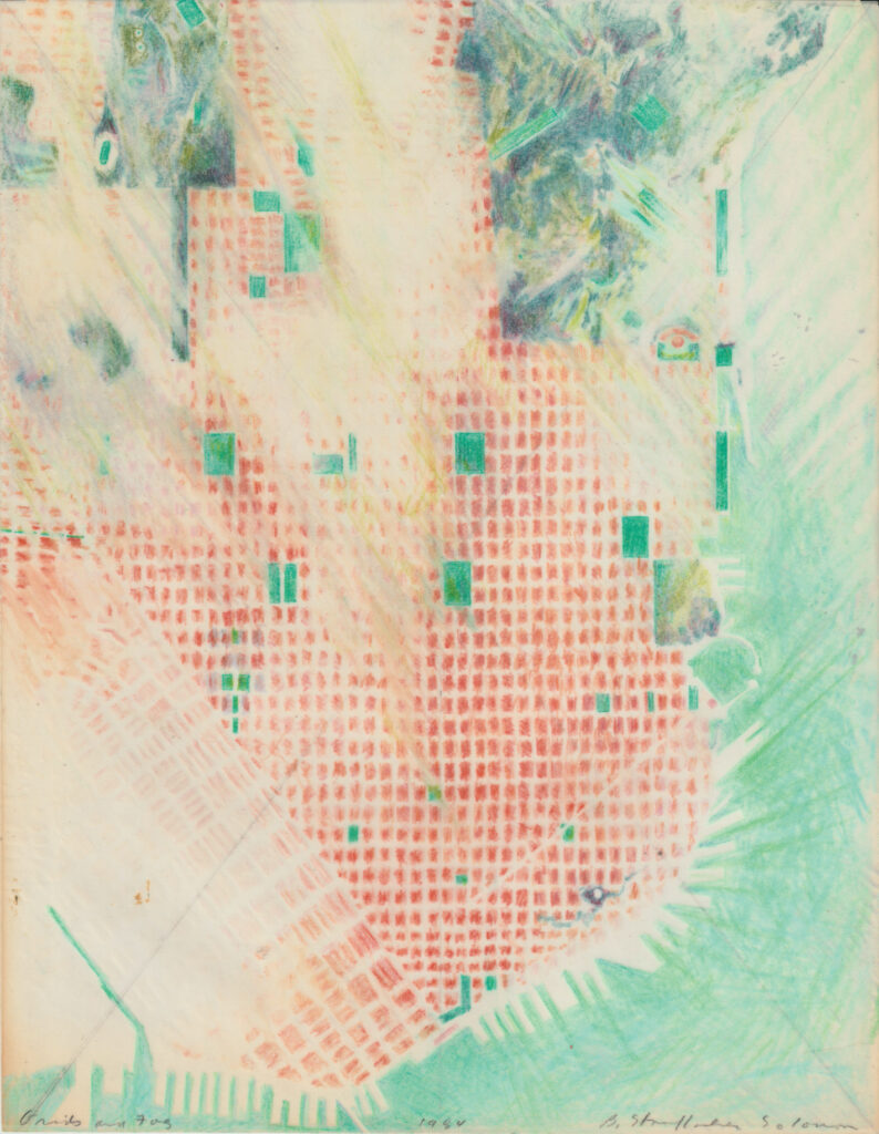
Drawing maps of Rome brought me home to draw more maps of San Francisco, and more green rectangles—Golden Gate Park in San Francisco, a grass plaza in the Napa Valley, a wood between two houses, an urban garden, an ideal hut, a paradise garden, the skyscraper of universal civilization, and the American dream. Green rectangles constructed as playgrounds, or that have become green theaters. A backyard in the marina, an orchard in Spain, a swimming pool at Stinson Beach, and a pier in San Francisco—which is intended to be built—as a green and white marble plaza over the bay.
But still the same green rectangle.

