Living Outside the Box: Mary Otis Stevens and Thomas McNulty’s Lincoln House
An instant sensation in the international architectural press, the 1965 Lincoln House was completed in Lincoln, Massachusetts, by Mary Otis Stevens and Thomas F. McNulty for themselves and their three small sons. Architectural Forum paid the house the exceptional tribute of commissioning a silkscreen of it for the cover of its November 1965 issue. Peter Blake, the magazine’s editor-in-chief, heaped praise on it in an abundantly illustrated article. In France, Architecture d’Aujourd’hui featured it in February/March 1966. In Germany, Deutsche Bauzeitung put it on its November 1966 cover.
The large-circulation press embraced it with equal speed and enthusiasm. Life magazine featured it in December 1965, the French women’s magazine Elle in 1966, and the Australian edition of Life in May 1968. Its appeal was lasting. Five years after it was built, the L.A. Times sent Julius Shulman—after thirty-five years, he still remembers being impressed by it and its young architects1—to photograph it for the weekend section of the August 1970 issue, where, once again, it made the cover.
The house met with such resounding success for many reasons. It is probably the earliest house in the United States built of glass and exposed concrete. It was designed by the young MIT-trained couple when collaborative couples like the Eameses were a rarity. As was true for the Eameses, this couple’s work and living spaces were not separated. The house didn’t look and wasn’t built like any other. And even more remarkable: No house redefined domesticity as it did. It was daringly original.
Granted, there was nothing novel in 1965 about using exposed concrete in large buildings—Le Corbusier had used it at the Unité d’Habitation and La Tourette; Felix Candela had exploited the engineering qualities of reinforced concrete in his shell structures in Mexico; Kahn’s Salk Institute had just been completed; Le Corbusier and Eero Saarinen had experimented with its plastic possibilities in the Philips Pavilion and the TWA Terminal respectively; and Paul Rudolph had used it at the Arts and Architecture Building at Yale.
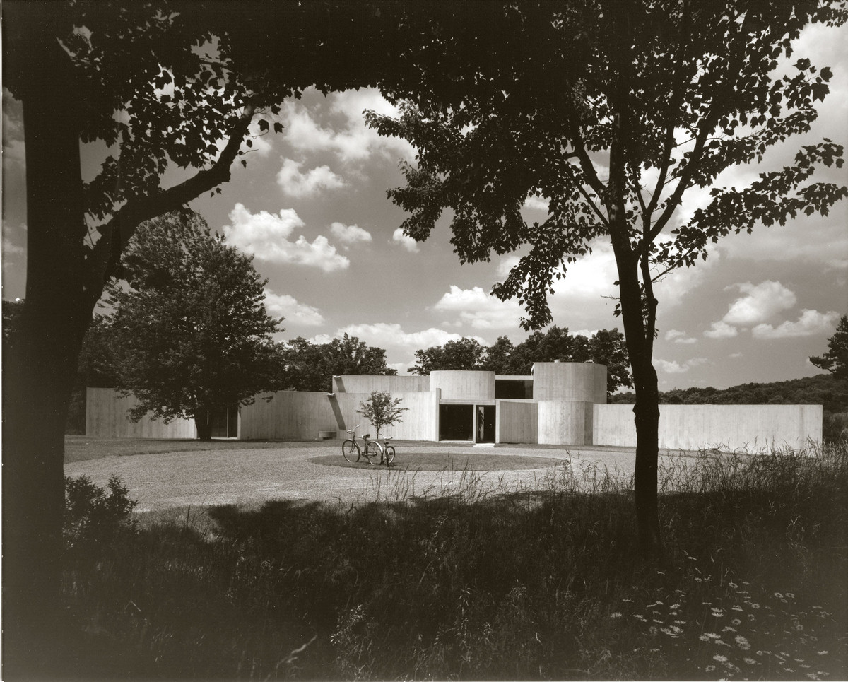
But a single family house using exposed poured concrete as its primary building material other than glass, particularly in the idyllic New England setting of Lincoln, was shocking. It rocked the town the same way the Gropius House had in the late 1930s. The 1959–1962 Esherick House of concrete virtuoso Louis Kahn looked like exposed concrete but wasn’t (it was clad in dark stucco). The Lincoln House was poured concrete inside and out, and in its purity was more radical than John Johansen’s Labyrinth House, built a year later, which used poured-in-place concrete for its exterior but other materials for most of its interior finishes.
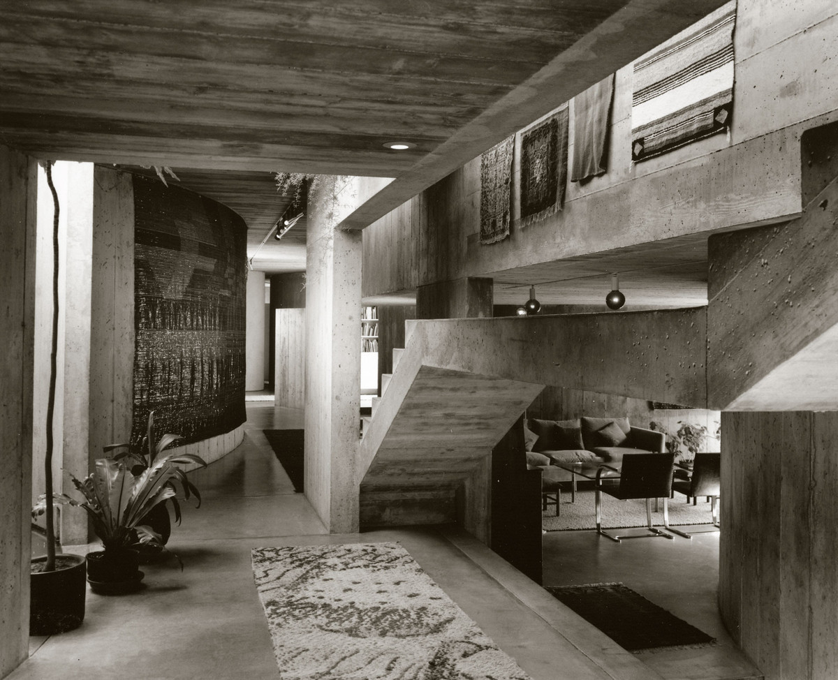
The house was exceptional most strikingly in the unusually sensuous quality of its cement. Stevens and McNulty had selected a type with high lime content. It was inexpensive, normally used in basements, where no one minded its variations. But it was much whiter and chalkier, more marble-like, than ordinary cement. And its coloration was also more variable, ranging from white to shades of grey. “For us this was an advantage, because it created a play of light and dark,” Stevens remarks. “The variation in the wall was closer to that of stone. It had highlights. It was very natural looking, not uniform like normal concrete.”2
The construction was no less noteworthy. John Carbone, who had been a student with Stevens at MIT and who came from a Boston family of Italian contractors, ensured the that the architects’ desire to express the interplay between the abstraction of the design and the fine texture of the pale, chalky surfaces was met. Working as a team, they decided to use 2 x 12 inch Douglas fir planks to make the forms for the concrete. Reinforcing rods were then put in, then steel ties. The concrete was poured through a pressurized hose, vibrated, and allowed to cure before the forms were removed. The innovation was that the boards were then re-used—something that might not have been economical in a large building because of the difficulty of organizing boards on that scale. In a small one, this procedure avoided the high cost of formwork in poured concrete construction in which you have to “build the building” first in wood then tear it down. In addition, the Carbones managed the stages of construction so that the boards could be cut and made thinner to fit the rate of curvature of each particular wall. The result, according to Stevens, was a fluting of varying degrees of fineness, “similar to Greek and Roman architecture in achieving the effect of relating a monolithic structure to the human scale.”
Another ingenious structural aspect of the house was how it adapted to the infinitesimal yet constant movement of the concrete. Each of the curved walls was a freestanding element, connected to the next by a glass panel. Because the walls were independent and not restrained, they were free to contract and expand with changes in temperature. The problem of dealing with this indeterminate structure was relatively easy to solve in relation to the glazed sliding door partitions because the curves had reached their tangency points, their stresses resolved, before terminating and so were no different from straight walls when they received the glass panels. But the problem got thorny at the roof. A flat concrete roof is always tricky, but problems here were compounded by the constant movement of the bearing walls and by New England’s big temperature changes. The architects and contractor decided not to tie but to “float” the concrete roof slab by placing Teflon strips continuously on top of the walls, which had been notched to receive the roof slabs. Thus cracking was avoided. And although occasional leaking did occur, the fact that the inside walls were exposed concrete meant there was nothing to damage on their surface. The family accepted this as an integral part of the life of the house, saying when it rained that “the walls wept.” They would dry, and that was that.
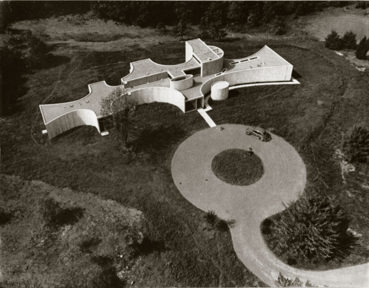
Then there was the form of the house itself: a series of concavities embracing the landscape. The purpose behind these curves was to have, in Stevens’s words, an “extroverted rather than introverted” environment. The person who understood this immediately was Buckminster Fuller, a frequent visitor to the house and a family friend of the Stevens family. “When Bucky visited, he noted that his own buildings, from the Dymaxion houses to the geodesic domes, were enclosing, and therefore inward-looking. Our building looked outward into the beautiful nature of the site.” Buckminster Fuller went on to point out that this house was “the negative of his positive.” He was correct. It was exactly this extroversion that the architects had been after.
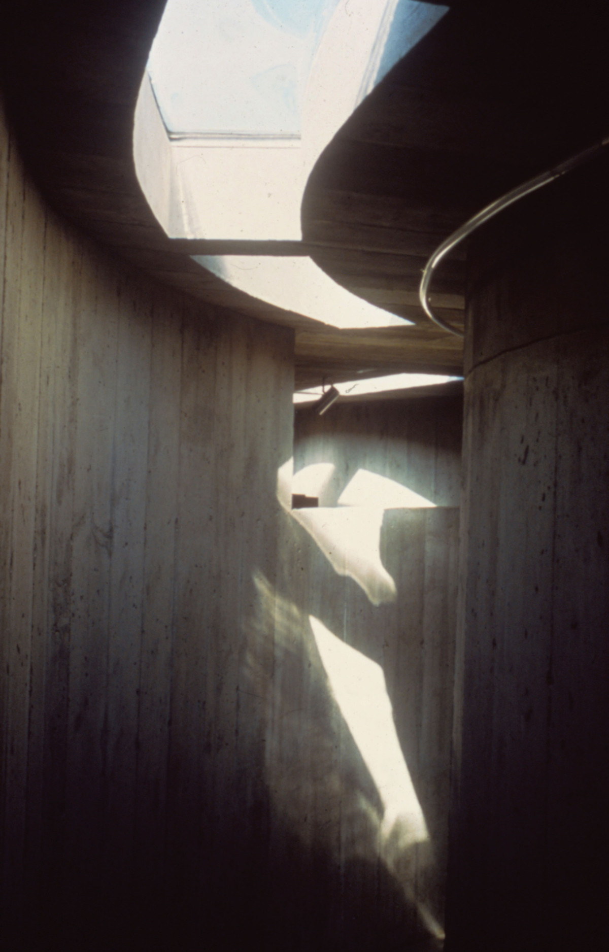
The curvilinear geometry imparted a strikingly sculptural character to the building. Life magazine had called it “a sculpture for living in.” But the house was not conceived as a free-standing sculpture. This would have meant reducing the surroundings to a picturesque backdrop. What the architects had in mind was for the building to reach out to the natural order, to be part of it. In other words, their impetus was similar to that of land artists like Michael Heizer, Walter de Maria, Nancy Holt, and Robert Smithson, whose works had just begun to appear about that time. Like these artists, Stevens and McNulty were trying to integrate their work within a broader topological frame. For example, the Lincoln House was also a sundial. Sited so that its longitudinal axis was exactly N-S, each cloudless day at noon a streak of light would shoot down the stairs and extend its length, as the afternoon wore on, along the pathway leading to the children’s area.
To connect the building to a larger scale of land-art composition, the walls were made irregular curves and varied in length and rate of curvature. The reason for this, as Stevens explains, was to prevent a closing, to allow them to extend indefinitely into the landscape. The asymptotes of their curves became shadows the sun cast on the grassy plain around the house. “The curves were throwing you out rather than holding you in. Each projected its energy into nature. We used the invisible power of the concave walls to relate the building beyond its site to the woods and fields of rural Lincoln — and beyond to the universe itself.”
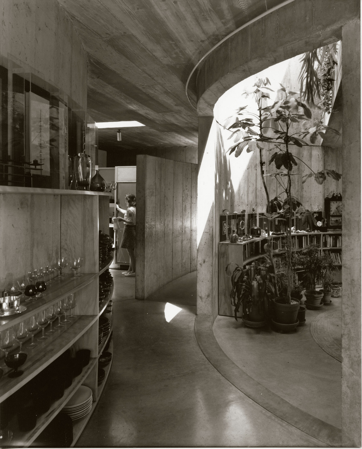
But not all in the house was dynamically extroverted and “energy-releasing.” The circular library and the studio directly above it were designed to counter the outward-reaching curves. They were the introverted “heart of the house, like the keep of the castle,” in Stevens’s words. They formed a cocoon-like shelter. The architects believed that the combination of extrovert and introvert elements was necessary. As Stevens recounts, “in our daily living, we wanted experiences of both kinds—the inner and the outer life. The play and living areas were strongly tied to the outside. On the other hand, in the most private parts of the house—the sleeping areas, studio, and the library—the architecture reflected the need for intimacy.”
Intimacy was a key concern for the young family. Stevens still uses the term constantly in discussing the house. Looking back at her twelve years of living in the house, she says, “In our society we value privacy but not intimacy. Intimacy is something shared. Being able to share life with others in close quarters is physical and emotional. Americans aren’t used to that. Americans have lived alone on big tracks of land. Daniel Boone said that whenever he saw smoke from someone else’s chimney, he felt like moving on. People tend to barricade themselves on big pieces of property. The size of the McMansions is such that family members can live without true encounters; they don’t have to ‘bother’ with others. They can live a life of virtual reality. Being isolated is thought something to be prized. Thoreau couldn’t stand his Concord neighbors. He’s a hero in the United States, whereas in other cultures he would be considered a misfit.”
The search for intimacy goes a long way in explaining the scale of the Lincoln house. To foster family relationships, spatial configurations were relatively small, and transitions were important in the movement between them. The house was the last of the Mohicans in this respect, the last to give domestic architecture a moral definition, a tradition that had its roots in the Arts and Crafts movement and in particular Frank Lloyd Wright’s Prairie House.3 This is exclusively an American phenomenon, one for a country whose rootlessness was generalized. In Chicago it was compounded by sudden, massive industrialization at the end of the 19th century—portrayed in the fiction of Dreiser and Sinclair Lewis — the home became the all-important locus of sociability and togetherness. Frank Lloyd Wright’s term for this was also “intimacy.”
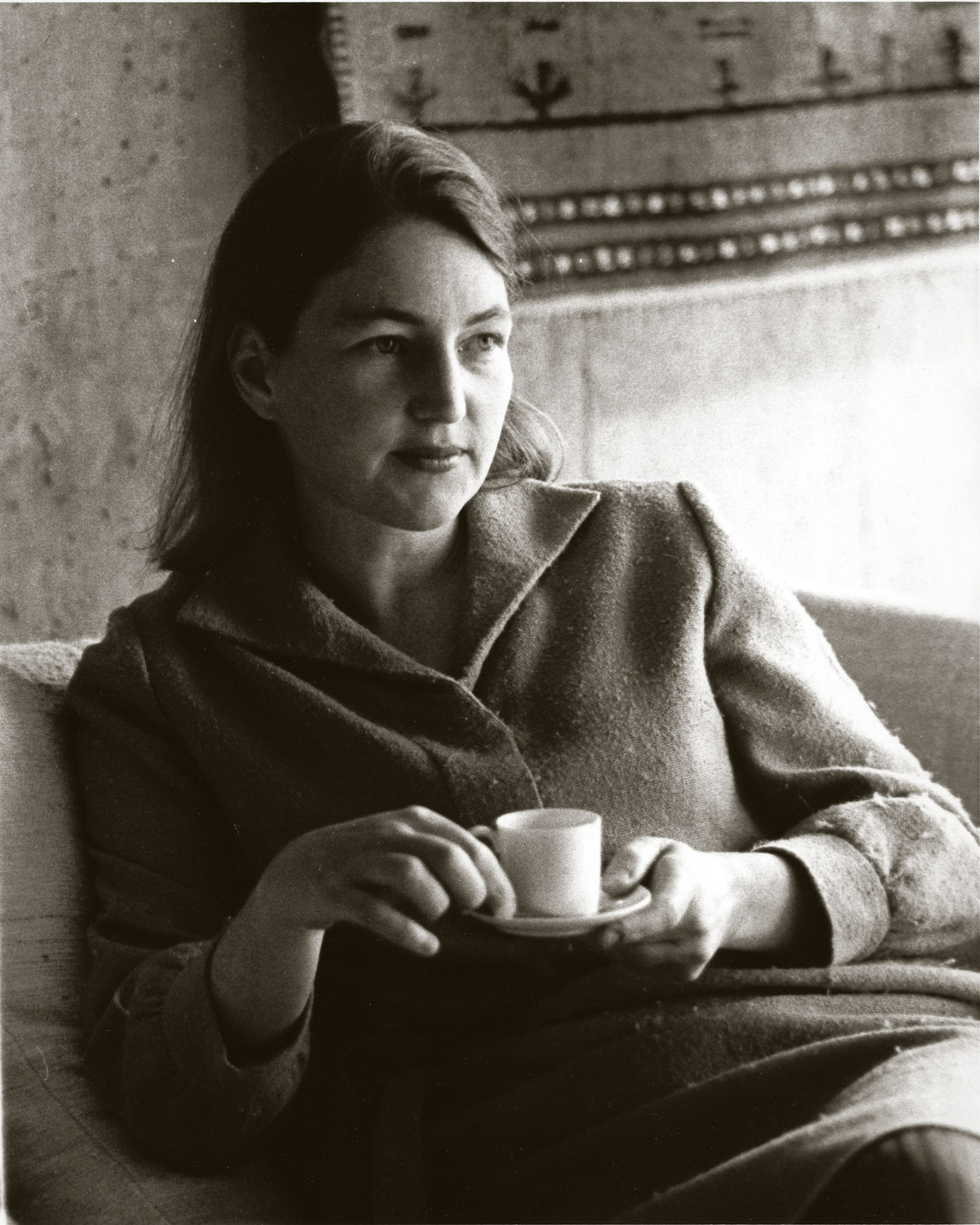
For all their attachment to Wrightean intimacy, to traditional family values, and to the principle of raising children in a nurturing environment, Stevens and McNulty were bent on reforming the family’s sexual politics, more specifically the traditional hierarchical patriarchy it tended to entail. Stevens felt especially strongly about this. Like the rest of her generation, she entered the professional world with a keen sense of defending her rights as a woman. In addition, as a descendant of the Mayflower-era colonists and with family ties to the circle of the 19th-century Emersonian Transcendentalists, she naturally conceived the house as a microcosm for the playing out of more general democratic, egalitarian ideals of freedom. So to intimacy they added freedom as a goal of their domestic design. “The spatial continuity between environmental functions implies that one would be absolutely free to develop a scope and sequence of activities by the day, lifetime, year—the increments of time, like the uses of space, being individual determinations.” This fine balance between intimacy and freedom was carried out in a spirit that might be called one of “critical domesticity,” at once committed to family but also conscious of the need to adapt it to new realities and competing needs.
To materialize this new definition of domesticity, Stevens and McNulty enlisted “movement” and “hesitation” as their basic design concepts. They had been among the generation of American architects who had been influenced by the previous generation, the Smithsons, Shadrach Woods, Giancarlo de Carlo since the early 1950s, not to mention Louis Kahn. These architects had been among the first to ensure that human movement was fostered in their urban designs as a means of enhancing community.
Stevens and McNulty had also happened to be in the right place at the right time: MIT had been the most multidisciplinary school in the country with the most open curriculum. Stevens had entered in 1953 and graduated in 1956. McNulty came to MIT as a master of architecture student in 1949 and was fortunate to have had Alvar Aalto as his studio professor. In 1950 William Wurster, then Dean of Architecture there, hired him to teach, and he began his long collaboration with Gyorgy Kepes, who, even earlier than the Europeans, was influenced by his teacher Lazlo Maholy-Nagy on movement in architecture. Founding the Center for Advanced Studies in the Visual Arts in the late 1950s, Kepes was interested in connecting art and technology. McNulty was a Fellow at the Center and worked with Kepes on a number of projects. The two, along with Stevens, were chosen to design the “City at Night” exhibit at the 1968 Triennale, where they used moving lines of light, each line programmed with a different time sequence, to turn a 100 foot corridor into a place celebrating human movement.
This background explains to a large extent why, from 1956 on, when they started their collaboration, Stevens and McNulty had a deep interest in design as a means to socio-cultural ends. They were among a small minority of architects at the time who, like Le Corbusier, felt that theoretical exploration—what he had called “patient research”—was a necessary component in developing instrumentally innovative design tools. Visualizing alternatives to the status quo became the focus of intense theoretical work for the next fifteen years, as demonstrated in a collection of over 300 drawings and diagrams as well as many texts in the Stevens/McNulty Archive at MIT. If the Lincoln House is the materialization of this patient research, then their book of 1970, World of Variation, published by George Braziller as one of the first in the i Press Series on the Human Environment, is a summary of it.
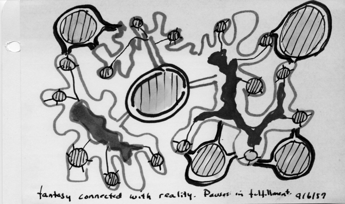
Indeed, before designing the Lincoln House in 1963 and 1964, the architects had been developing design ideas that reflected their vision of how societies could be reformed to meet and express contemporary life. “Best suggested in an imagery of movement, hesitations (as one might term the clusters of activity) compose an individual’s private life in society. Envisioned as evolutionary ideas, they become episodes of eating, sleeping, working, relaxing, learning, within a stream of time and space.”4
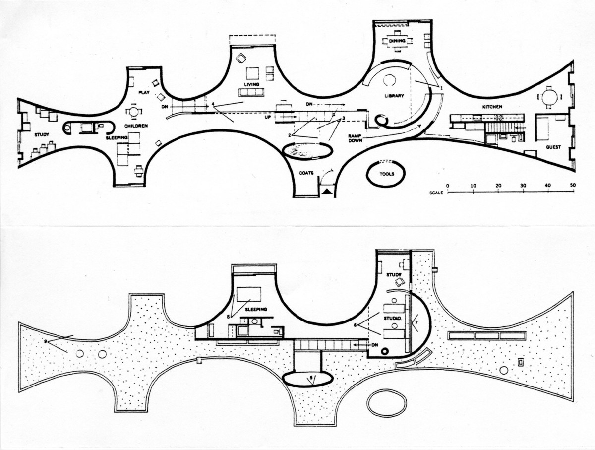
World of Variation focused, like the Lincoln House, on design for human movement. Like the Children’s Home of Aldo van Eyck (1960), the Lincoln House was conceived as an urban microcosm. Like the diagrams of the Smithsons, the diagrams of the World of Variation visualize both kinds of situations: the free flow of movement and points of “hesitations” for encounters at intersections. The long corridor linking the children’s rooms with the rest of the house was intended, for example, to encourage free flow and connection. But the nexus point where the living room, eating area, stairs to the parents’ rooms, and entrance area were points of “hesitation.” Of particular interest in this connection is the large collection of the designers’ sketches over the years. They differ from the architectural drawings of the prewar period in that they describe not the facade of the ground plan nor the axonometric or isonometric elevations. In the parlance of our times, they were “diagrams,” a specific kind of drawing charting the flow of movement, which entered architectural culture in the wake of Louis Kahn’s drawings for the Philadelphia plan. Among the last publications to have used this kind of drawing were probably this book by Stevens and McNulty and Shape of Community by Serge Chermayeff and Alexander Tzonis.5
The great formal and conceptual originality of the house stems from the architects’ total rejection of preset notions of what a house was. This freed them to transfer their own ideas about movement and hesitation on the scale of the city to the scale of the house. The very plan of the building is an almost literal translation of the diagrams in their book for both formal and social purposes.
To maximize freedom and movement in the house, for instance, the architects eliminated most interior doors. As Walter Gropius remarked to the architects after visiting the house in the late ’60s, “it is one continuum.” The parents’ bedroom and office/studio were upstairs, creating a kind of estuary. The children’s zone at the south end of the house was another. Everything else was open. The only exceptions were the bathrooms and one bedroom off the kitchen, which was a guestroom. But even that bedroom’s walls did not connect to the ceiling, so the bedroom could join the flow of the rest of the house. Stevens says, “You needed to keep moving in order to take it all in. The inherent movement in the curvilinear geometry kept pushing you dynamically through the space, rather than confining you to one vantage point.”
The house fostered movement not only between the different areas of the interior, but also between the inside and the outside. Although there was one regular front door, made of steel and glass, there were no fewer than six other points where one could gain access to the outside on the ground floor. These were the sliding glass doors, between the undulating walls. The intention was that they didn’t really read as doors, just as openings.
Consistent with the ideas of intimacy and hesitation, the freedom of circulation was intentionally constrained at the core of the house, where the library, the kitchen, living room, staircase, and fountain were clustered, forming a multi-layered network of points of hesitation. “Mobility in the circulation of the house allowed you to come and go several different ways,” Stevens recounts. “There were different ways of going back and forth, as in a city. This allowed the children to bypass the living room and the grown-ups if they wanted to, although they were seen. You didn’t have to engage with people directly; you could if you wanted to. In moving through a space, you look for options. You might want to be in the extroverted piazzas; you might want the introverted spaces of the side streets. The important thing is that you have the chance to choose.”
The intention of balancing freedom and intimacy, movement and hesitation is very clear: “What we were interested in was not just movement per se. We wanted to make the house into a kind of miniature city: It was very urban. The idea was to bring people together, not isolate them in boxes on different floors. You had choices all the time. The circulation pattern of the house was multi-layered, as you can see in the section. It was on two levels, so that people could pass each other like trains in the night, as the children often did to avoid us as we talked with our friends. You went down two tiers of twists and turns, as in any hill town where you move with the shape of the land. The idea was that no one would ever be stuck in one place. If you weren’t happy with the social scene, you could leave. By the same token, you were never isolated; you could always join in, directly or indirectly, as an actor or a spectator.”
Arguably, the Lincoln House exceeds the category of experimental domestic architecture. Never has a building of any other type embodied the idea of movement more thoroughly; it carried the idea of design as diagram to the extreme.
I think that the house is a masterpiece. There can be no doubt that it stands way above the other experiments in domestic architecture of the time—and there were many extremely exciting ones, including the Monsanto House, the Eames House, Jean Prouvé’s houses, Neutra and Schindler’s, Frank Lloyd Wright’s, and so on. No other house combined so many different novel features—formal, constructional, and social. That one of the designers was a woman, mother, and MIT-trained architect is undoubtedly the major reason. If passion is anything to go by, all one has to do is listen to Mary Otis Stevens forty years after the construction of the house. When asked why she had been committed to this kind of design, she declares, “I was against ordinary American domesticity. I didn’t want my children to grow up in the conventional restrictive environment I had been brought up in. This was the ’60s. I wanted my sons to be part of the flow of life. Before the industrial revolution, children and adults had shared a common life, and I wanted my children to be able to leave the child world and enter adult life when they wanted. The children’s quarters and the parents’ quarters were always open. There was no difference in the living standard. There was democracy. There was freedom and individuality, but also community. The individual and the community should be nourishing each other and be held in balance.”
If the house is a masterpiece, why has it been totally forgotten? Indeed, after the late ’60s, it sunk into oblivion and has remained shrouded in a fog of forgetfulness. The reason is the “narcissist” retour à l’ordre, in which postmodernism’s deep conservatism replaced the experimental, daring spirit of the ’60s.6
The house was perceived as an aesthetic outcast in Lincoln. The same reception has befallen too many Modernist buildings. To name what was probably the first such case, the contemporary Viennese press universally reviled Adolf Loos’s shop on the Michaeler Platz in Vienna. Emperor Franz Josef said it “had no eyebrows” (i.e., no pediment above the windows). Today it is called an architectural masterpiece in the tourist guides. What a tragedy that the Lincoln House, before it could become a cult object, was torn down by someone who bought it in 2001. One wonders how the town of Lincoln could have permitted this.
Stevens is glad that she and McNulty (who died in 1984) got the opportunity to build it in the first place, because she believes it brought an architectural idea through the process of construction without sacrificing its power or integrity. “From idea to reality and back to idea: The circle is now complete,” she declares philosophically, even transcendentally.
I am collaborating with the architecture department at UCLA to rebuild the house in 3D for an exhibition at MIT planned for 2007. It may yet be possible to get a faint sense of what being in this small masterpiece was like.
