Making Gardens, Making Books
When Michael Van Valkenburgh arrived at the Harvard Graduate School of Design as an assistant professor of landscape architecture in 1982, Henry N. Cobb (known as Harry) was chair of the department of architecture and a universally respected figure. Van Valkenburgh and Cobb became friends and frequent collaborators as they built their practices: Michael Van Valkenburgh Associates (MVVA), in Cambridge and Brooklyn, and Pei Cobb Freed & Partners, in Manhattan. Van Valkenburgh (the Charles Eliot Professor in Practice of Landscape Architecture, Emeritus) recently published the book Designing a Garden (Monacelli Press) about the creation of the Monk’s Garden, a small walled garden at the Isabella Stewart Gardner Museum in Boston. Last January, just a few months before Harry’s death, Van Valkenburgh, Matthew Girard (the garden’s project designer and a 2010 graduate of the GSD’s MLA I program), and Alexander Luckmann (an MVVA designer and part of the book’s editorial team) met with Cobb to talk about the book.
HENRY N. COBB
As you know, Michael, your book really grabbed me. It grabbed me in two ways. First, on account of its visual and tactile qualities; that is to say, as an object with a cover, paper stock, typeface, images—in a word, its form. And second, on account of its communicative power, that is to say as a bearer, through text and images, of ideas, thoughts, reflections—in a word, its content. Through its brilliantly executed integration of form and content, Designing a Garden becomes much more than just a monograph to be looked at; it becomes a book to be read.
As you might guess, my obsession with this distinction is the result of having recently produced my own book [Henry N. Cobb: Words & Works 1948-2018: Scenes From a Life in Architecture (Monacelli)]. Do you have a copy? I know I sent it to you.
MICHAEL VAN VALKENBURGH
Yes I do. And it is a fabulous book. In fact, in 2018, when I got back from a vacation, and I had been working on my book, yours had arrived in the office and somebody had stood it up on my desk. We had talked about your book before, so I knew it was a cousin, if you will, of what I was trying to do. Of course, I admired the care with which your project stories were told, and the small format was unexpected and I loved it. The message that day was “Harry’s book is finished and mine isn’t.”
HARRY
So let’s consider first the form of your book. It has a beautifully embossed red cloth cover. And the size is comfortable—smaller than 8.5” × 11” but with approximately the same proportions.
MICHAEL
At one point in the development of the book, it was landscape format. My wife, Caroline, opened that version and said, “I can’t hold this in my hands.” Which is the problem with landscape format books.
HARRY
I agree. Between its covers, there’s an art to Designing a Garden having to do with the balance between text and images. In this respect I’d say it’s a skillfully performed high-wire act of book design. There’s a feast of spectacular images, many of them full-bleed; yet the text holds its own. By which I mean that the reader is not inclined to skip over it.
MICHAEL
Gullivar Shepard, a partner in my office, is partly responsible for the text staying graphically significant. He argued that after putting so much effort into making the text something that people can understand, we shouldn’t diffuse it by mixing it with images, but rather leave room for readers to enjoy the text. What he said reinforced the brilliant work that book designer Cara Walsh did to give ample room to both the images and the text. This book would have been unimaginable without her. Cara graduated from the MLA I program at the GSD in 2014 after designing books at Taschen for six years, and she brought her deep appreciation of landscape and her love of books to every part of the project.
HARRY
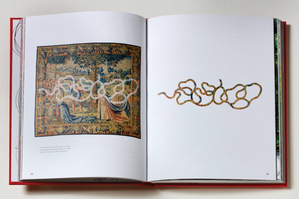
When you flip through the book, the images give a sense of what the text is talking about, but without threatening the primacy of the text. To accomplish this, it’s important that there are no images on the text pages. The way you start is very engaging. After a brief chapter on concept at the very beginning, you go immediately to the paths, which makes perfect sense as a way of telling the story.
MICHAEL
Yes. The paths are what drove the investigation from the start.
HARRY
While we’re talking about the paths, I want to mention my one serious quibble with the content of your book. It’s obvious from both text and images that the joints between the bricks play a critically important role in the design, the construction, and the use of the paths, and the reader wants to know something about them. But in the whole book, there are exactly two mentions of the joints, both of which are en passant and neither of which discusses what to me is an absolutely crucial detail that I’m dying to know about: What are those joints? What are they made out of? You don’t disclose it. How could you do that to me?
MATTHEW GIRARD
We filled the joints with a polymeric sand—a granular material with a polymer binder that hardens when water is introduced.
HARRY
So it’s intended to be permanent? It doesn’t have to be renewed?
MICHAEL
It’s lasting incredibly well. The garden is seven years old and there are only one or two places where the pavers have had to be reset.


HARRY
The whole evolution of the paths is fascinating. I think it’s definitely the way to begin the book because it’s the garden’s distinctive feature. I mean everybody has trees and groundcover. But only you have those paths.
MICHAEL
Thank you. A lot of work went into them.
HARRY
Another quibble: I don’t think it would have spoiled the book to include graphic scales in the plan drawings. There’s not a single scale anywhere in the book.
MICHAEL
Oh no; how did that happen? I’m a fiend about scales in the office! With computer drafting, I see beginners losing an understanding of how crucial scale is in landscape design, especially in small-scale projects like this one.
HARRY
Anyway, time to get to the essence of things. As I mentioned in my earlier message to you, it’s really the text that I most admire in this book. It introduces the subject very crisply, with the fascinating letter from Anne Hawley, and then conducts readers through the design process in a way that’s especially engaging because at every step it tells them what’s actually going on in your head. Even when you branch out from the garden project to explain your own background and how you experienced things as a child, it’s all very relevant to the subject at hand, making it a book with a strong story line that keeps the reader going.
MICHAEL
Ultimately, the book is really a defense of landscape architecture.
HARRY
Yes, I would agree. This reminds me that when I was asked to ruminate about the future of architecture in a recent talkfest at the GSD, one of the things I predicted was that there’s going to be an ever-increasing blurring of the boundaries between the design professions. I also said that this could be a good thing. But your book is powerful evidence that this may not be a good thing. Because when I read this book, I’m pretty much persuaded that the kind of intense focus that’s so important in the design of the Monk’s Garden could not happen if you were also trying to envision a building along with the landscape. The sensibilities involved are indeed very different. So I prefer to think of our two professions as conversing with each other, rather than merging.
MICHAEL
I’m going to tell you a story. We’re both, I believe, enormous admirers of Mack Scogin—as a human being, as an architect, as a teacher. And I’ve worked on a lot of residential projects with Mack and Merrill [Elam, Scogin’s partner in Mack Scogin Merrill Elam Architects].
HARRY
Yes. He’s told me about it.
MICHAEL
We hardly knew each other until he was designing a house in Brookline. It’s made out of an angular black brick, and it’s a very demanding work of architecture. It was completed in 1999, but the house was under construction before we were hired. I went there with Mack and I said something on the order of, “Well, what do you want me to do?” And he said, “All I know is that I don’t want it to have anything in particular to do with my architecture. Landscape is what’s outside of the building, and it should be something entirely different.” That’s so not what every architect ever said to me until that point. Especially for somebody like me who went to Cornell with Colin Rowe and all of those guys. To have somebody say that to me at that young moment in my career was transformative. And he meant it. He just wanted something that was equally robust but totally unrelated.
When I start a project like the Monk’s Garden, a big part of my process is thinking about what it’s not going to be. At that stage, everything is fluid and in motion, or at least it should be. I try not to intellectualize the creative investigation. Of course, at the beginning of this process I also thought a lot about the gardens at other museums.
HARRY
Such as?
MICHAEL
Well, such as the MoMA garden, which to me is not a garden. I happen to love it. But it really is a work of architecture.
HARRY
It’s also a gallery.
MICHAEL
It is a gallery! It’s a gallery where the trees are among the collected objects in the space. And they’re great ones! The fact that they used the weeping beeches, in particular, is awesome.
HARRY
Turning for a moment to the construction phase of the garden, I know that you [Matt Girard] were on the site from beginning to end. So I’m very interested in the way this part that you wrote reflects on the relationship between design and construction. You comment on the fact that when you were planting the trees, you rotated them and moved them here and there. And you changed the grouping of trees quite a lot. And that was all done during construction.
How did that process work? They actually brought the trees to the site and then you arranged them and talked and rearranged them?
MATTHEW
Pretty much. Michael or I would impersonate a tree, with our arms in the air, while the other gave direction from a distance—a little to the right, a little to the left. Then each tree was brought in with a small forklift and placed where we thought it should go, and we would make micro adjustments—change orientation and so on.
HARRY
The paths were already built, right?
MATTHEW
No. The whole garden was built north to south. This allowed us to make small adjustments to the paths as needed. We would walk the staked-out path, and if it didn’t feel quite right—if it wasn’t the right progression from what we were just on to what came next, or if a small shift could improve a view—we’d change it.
MICHAEL
Because the garden is accessible only from one end and is so narrow and surrounded by high walls, we had to start construction at the far end and back our way out, building the paths as we went along.
HARRY
That was the summer of 2013?
MICHAEL
Yes.
HARRY
And it was finished in September?
MICHAEL
Yes, it was basically built in five months, from May to September.

HARRY
If I may, I’d like to return for a moment to the text. It’s very successful, very well written. You and Matt must have had an editor, to make your two voices blend so seamlessly together. Did Elizabeth White serve as the editor? Who went through it all with a fine-tooth comb?
MICHAEL
Yes, Elizabeth [the editor at Monacelli Press responsible for the book] read it but when it was well along, so her touch came late in the game. At the end of the day, there was a small handful of significant contributors.
ALEXANDER LUCKMANN
Aidan Cronin, Jane Lee, Alec Spangler, and me.
MICHAEL
And Fred Bernstein. I read the book out loud two times with Jane and Aidan in the room. For me, hearing it read in the presence of two very gifted writers (and future practitioners of landscape architecture) was important. I can read something that’s not great and not notice how bad it is. But hearing it out loud, it’s like, “Oh wow—that doesn’t make any sense.”
HARRY
The world is flooded with books about architecture: books by architects, books by historians, and books by critics. My problem with all three categories is that they seldom throw much light on the process of design. In other words, they don’t offer the insight that you find here. Your book really gives students of landscape architecture something to build on. As a pedagogical instrument, I’d say it’s a masterpiece.
MICHAEL
The exact audience is a student in his or her first year of design school. I wish that this book had existed when I was in my first studio. Look, I loved my first year in school, and I did fine without a book like this. But for me there was always an enormous gap between what I was asked to do as a student and what I admired in the outside world. And I couldn’t imagine that what I was doing in school was going to yield the kind of work I loved. So I hope the book allows beginners to understand the process behind the kind of professional work they might like.
HARRY
Yeah. By the way, when you and I have worked together we always worked a lot with scale models. But models seem to have played only a minor role in the design of this garden.
MICHAEL
We made one model early on that was important, using pink string to form the paths, but the real models were full-scale, by which I mean that we were on site constantly, working with layouts of the design proposals as a model. And then we walked along the hypothetical paths, at full scale.
HARRY
Yes, that’s the very best kind of model—reminds me of the full-size model that one of Mies’s early clients commissioned. The actual house was never built. As I understand it, you had to raise the ground quite a bit at the entrance to the Gardner’s loggia to avoid having too steep a slope in the path.
MICHAEL
Well, we wanted the path and the entrance to be on the same level.
HARRY
So you raised the level about a foot and a half?
MICHAEL
It’s four or five risers, so that would be around 24 inches.
HARRY
The other thing you don’t talk about, but that I’m sort of interested in: is this all new soil?
MATTHEW
There’s a sand-based structural soil, like a blanket, about two feet deep, throughout the garden. The paths are built on top of that structural soil so that there’s a continuous rooting zone underlying the whole garden.
HARRY
So the roots can go right underneath.
MATTHEW
Yes, the roots can go under the paths.
HARRY
Doesn’t that mean they’re going to push the paving up?
MATTHEW
They haven’t yet. They’ve been behaving themselves very well. We worried that if we had done the paths the traditional way, with really deep non-rooting zones below them, we’d be making these tiny little islands for the trees.
HARRY
No, no, you wouldn’t want that.
MATTHEW
And the trees are doing. . .
MICHAEL
Almost too well!
MATTHEW
The caliper growth of the gray birch has been amazing.
HARRY
So is there irrigation?
MICHAEL
There is irrigation. Just drip, though. It’s all underground. Matt, do you know if the museum even still uses it?
MATTHEW
I was just wondering about that. I don’t know what their schedule is. They could probably get away without using it most of the year.
HARRY
How much did the garden cost?
MICHAEL
With fees and everything, it was under $1 million.
HARRY
Really. That’s interesting. So you got more bang for your buck in a garden than I get in a building.
MICHAEL
That will be in the story. That’ll be the banner: “Harry Cobb says you get more bang for your buck from landscape than from architecture!”
HENRY N. COBB was a founding partner of Pei Cobb Freed & Partners. His practice embraced a wide variety of building types around the world. Notable projects include the John Hancock Tower (now 200 Clarendon St.) and the John Joseph Moakley US Courthouse in Boston, the Harvard Center for Government and International Studies in Cambridge, Fountain Place in Dallas, Place Ville Marie in Montreal, the US Bank tower (formerly Library Tower) in Los Angeles, and the Portland Museum of Art in Maine.
MICHAEL VAN VALKENBURGH is head of one of the country’s leading landscape architecture firms, Michael Van Valkenburgh Associates, Inc. He provides senior leadership on a wide range of projects including the Obama Presidential Center in Chicago, the Ralph C. Wilson, Jr. Centennial Parks in Detroit and Buffalo, and Dix Park in Raleigh. Currently the Charles Eliot Emeritus Professor in Practice of Landscape Architecture, Michael has taught at the Harvard Graduate School of Design since 1982.
